Sol Bowl
What does it mean to have soul? Just ask Lilly from Sol Bowl. Since 2017, she’s been serving up good, natural food with heart from her spot in Parramatta. Sol Bowl was born out of her own need for a quick, wholesome meal she could enjoy with her kids—something vibrant, healthy, and full of flavour. When the brand reached out for a refresh, the goal was clear: bring out the natural ethos and bold personality of Sol Bowl, all while keeping the identity clean, modern, and versatile.
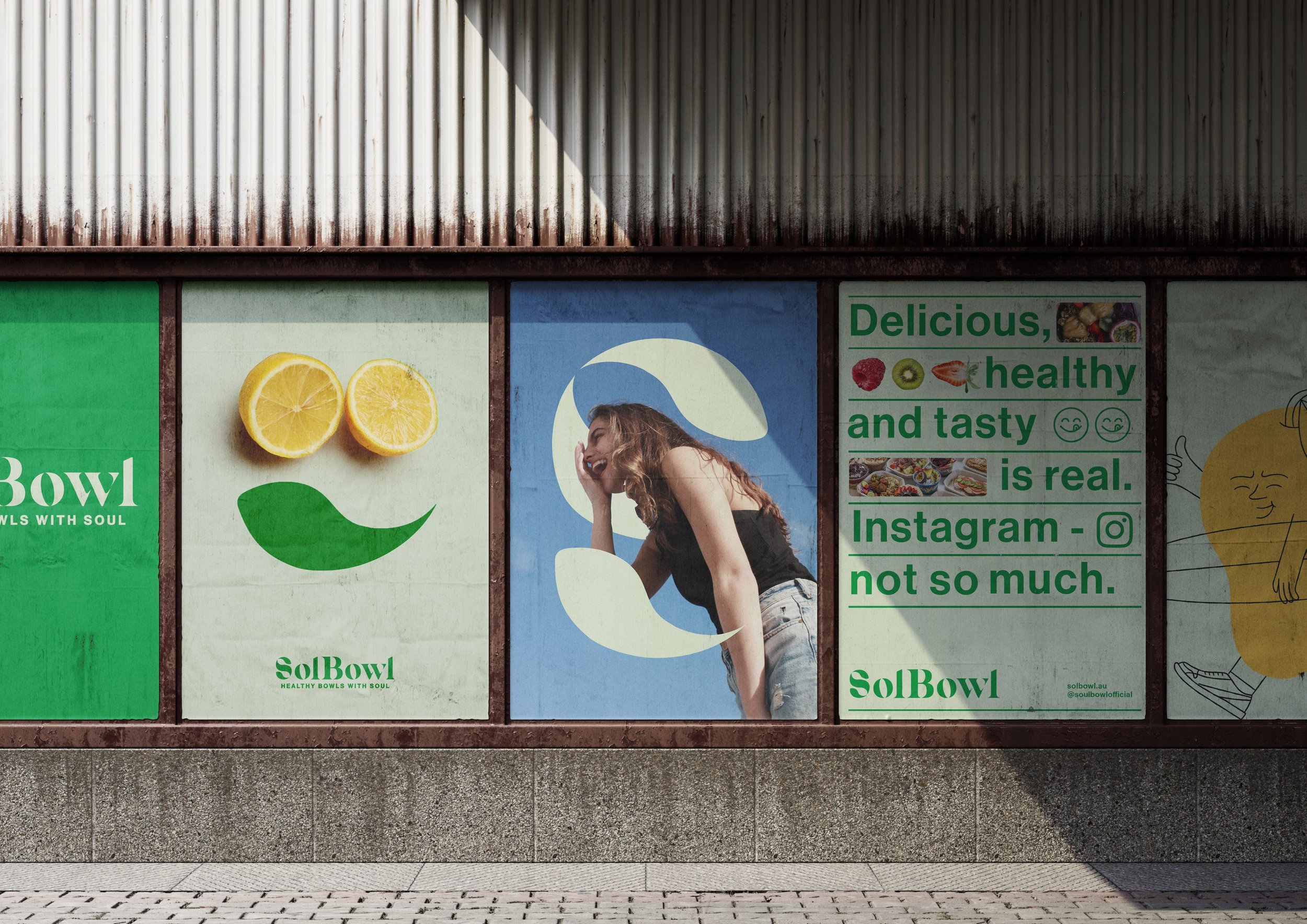
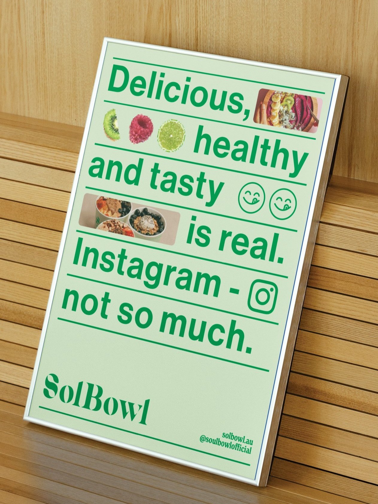
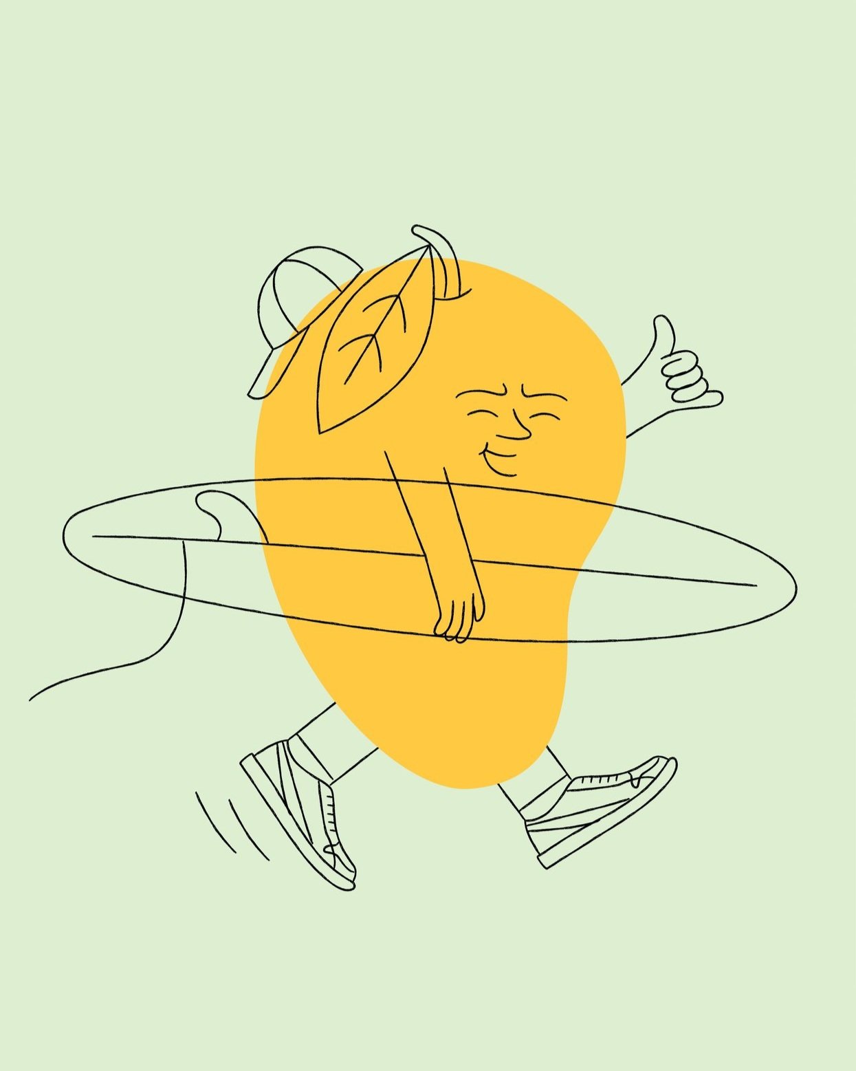
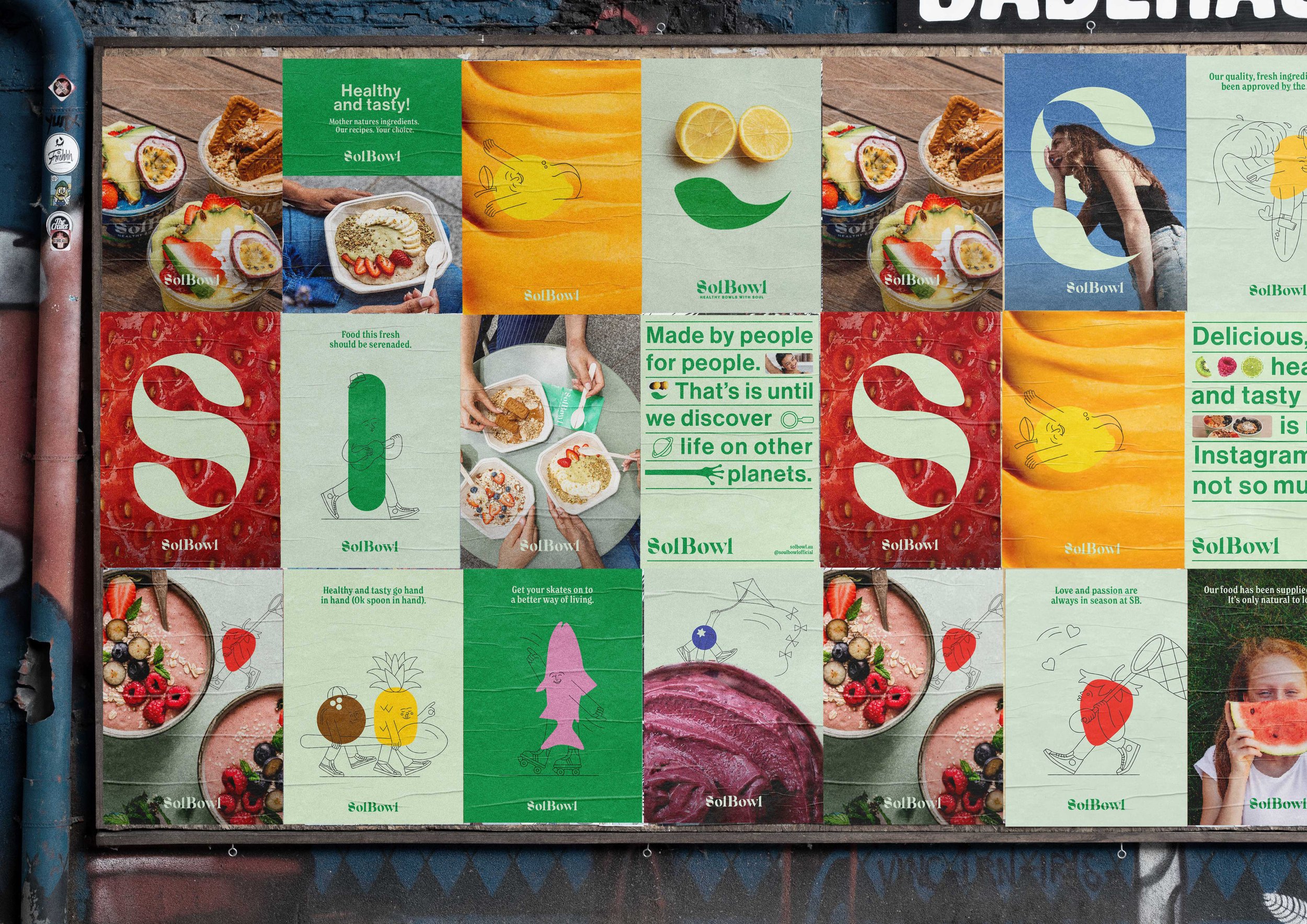
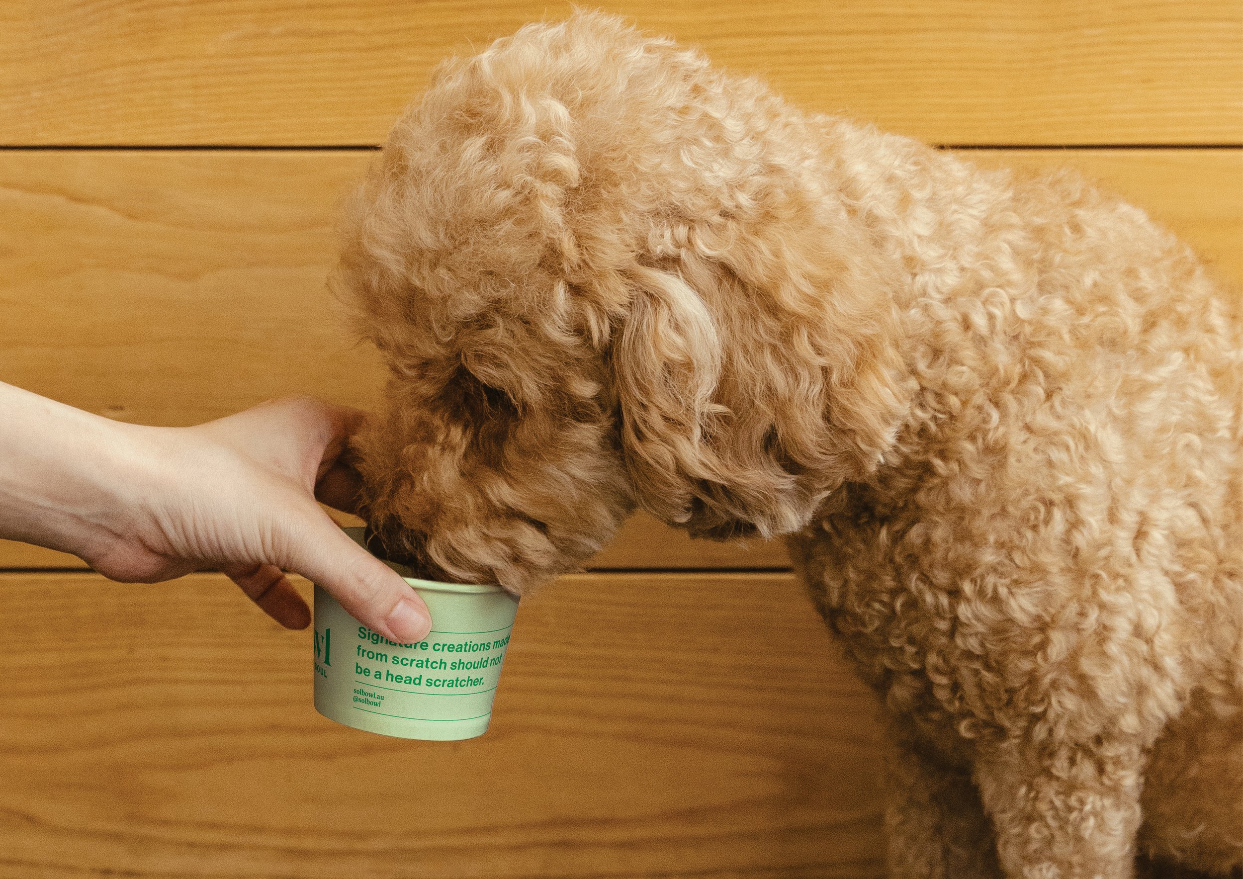
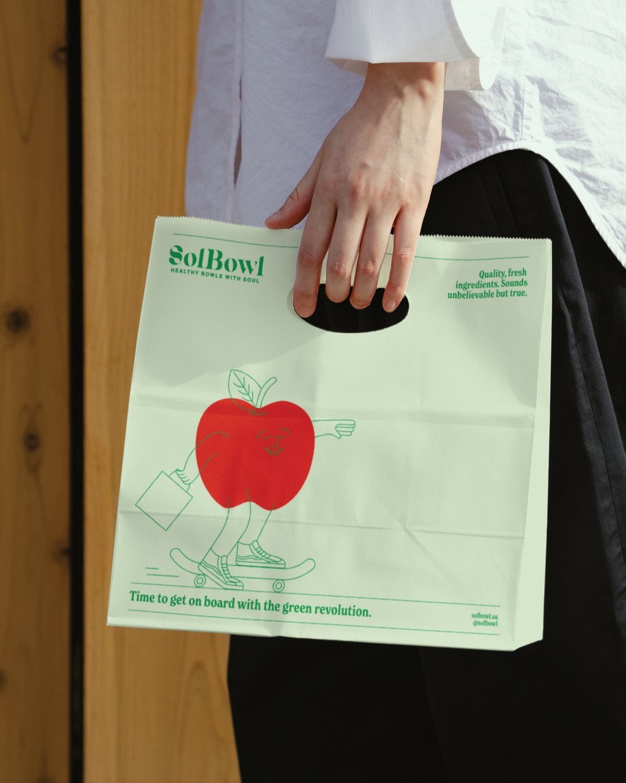
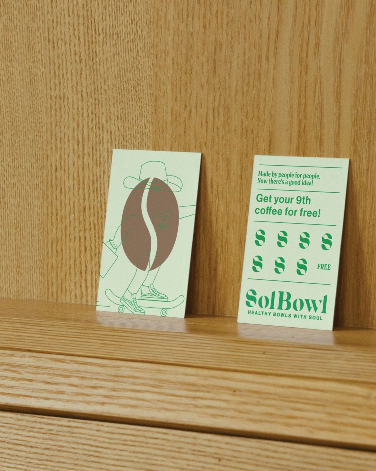
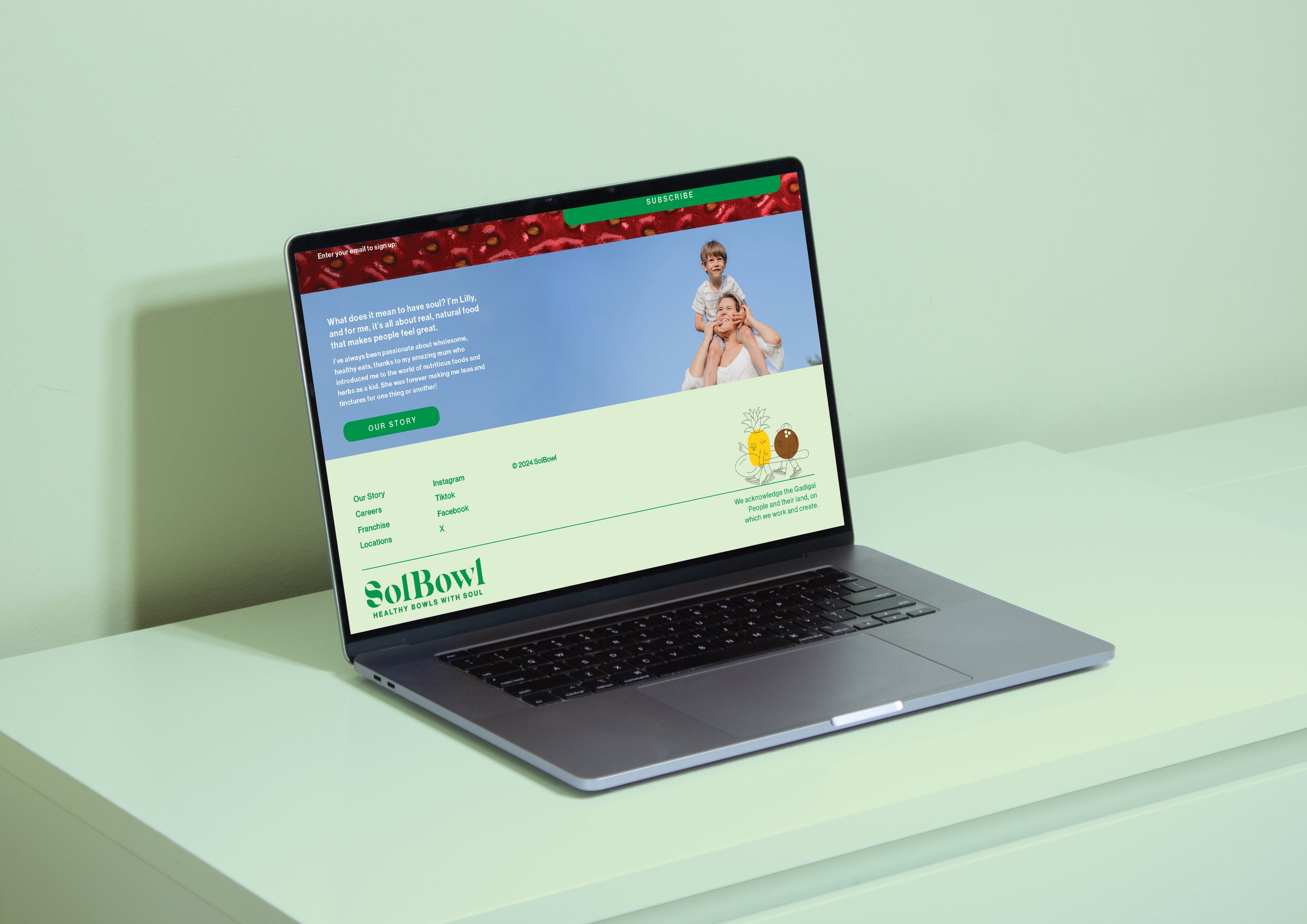
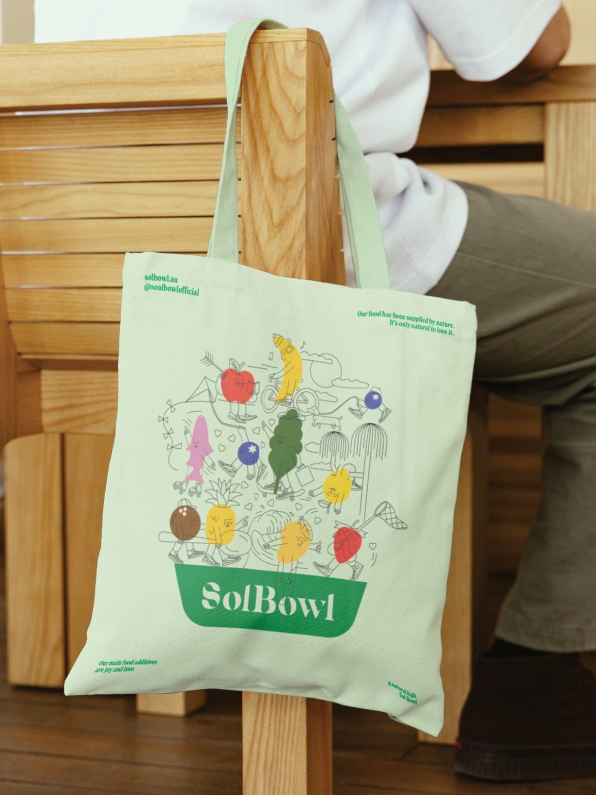
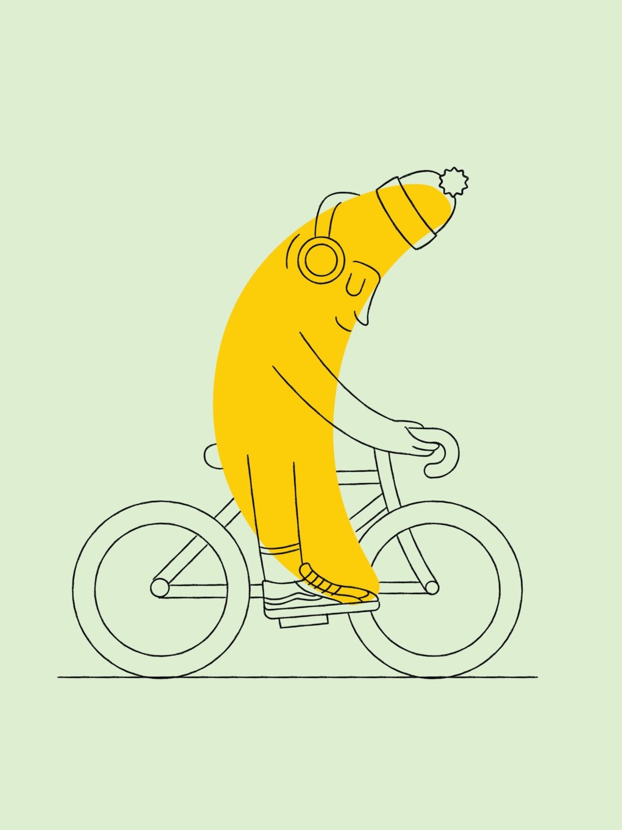
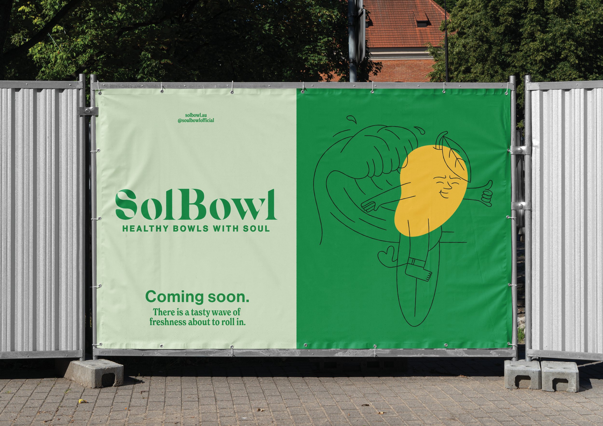
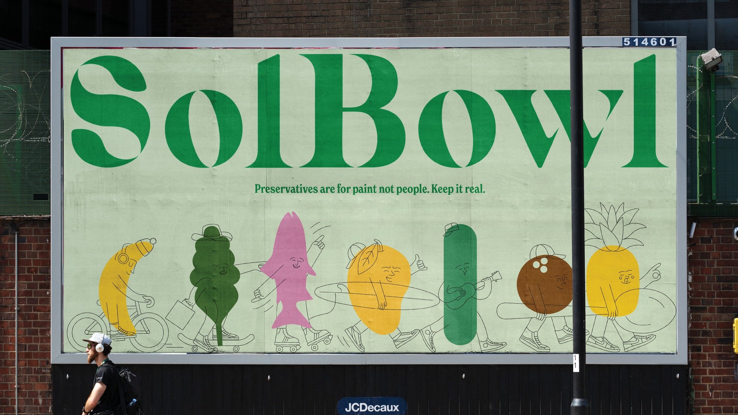
We kicked off by digging into the QSR landscape, pinpointing what was resonating and spotting gaps Sol Bowl could own. The result? A distinctive new mark—a bold ‘S’ with spoons hidden in the negative space and leaf details that nod to their fresh ingredients. We paired this with a customised typeface and a colour palette pulled straight from nature. To dial up the personality, we crafted playful illustrations blending ingredients with line-drawn characters from the community, alongside energetic copylines and a strong, stacked lockup system. These assets were designed to work together seamlessly across packaging, uniforms, interiors, and merch—building a brand that’s as wholesome and vibrant as the food it serves.
Illustrated and designed at The Creative Method.