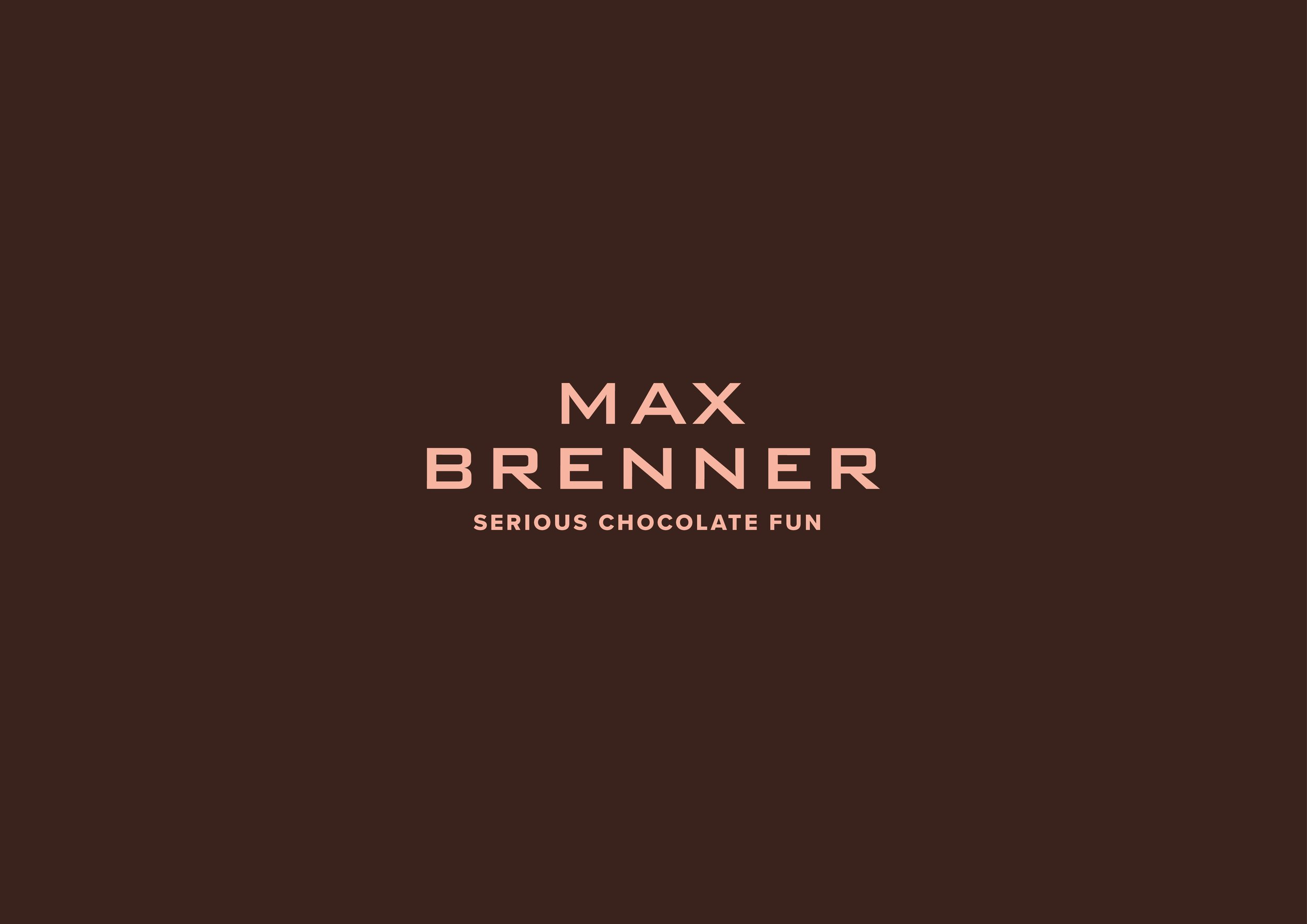
Max Brenner
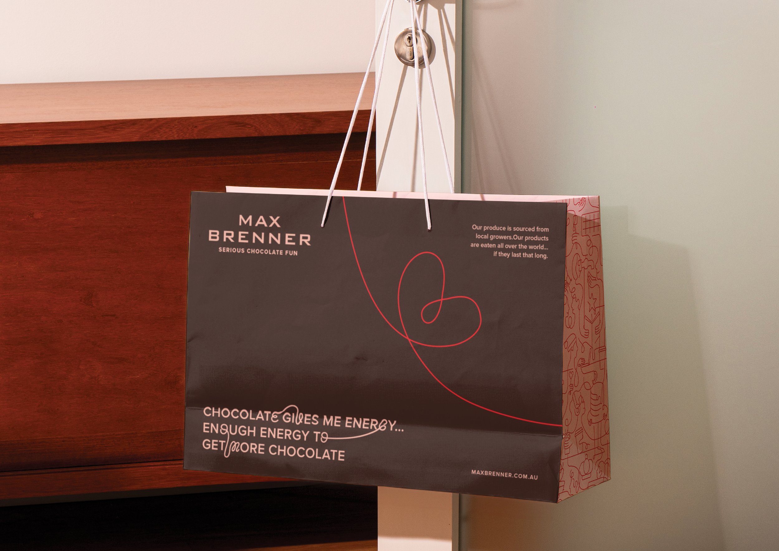
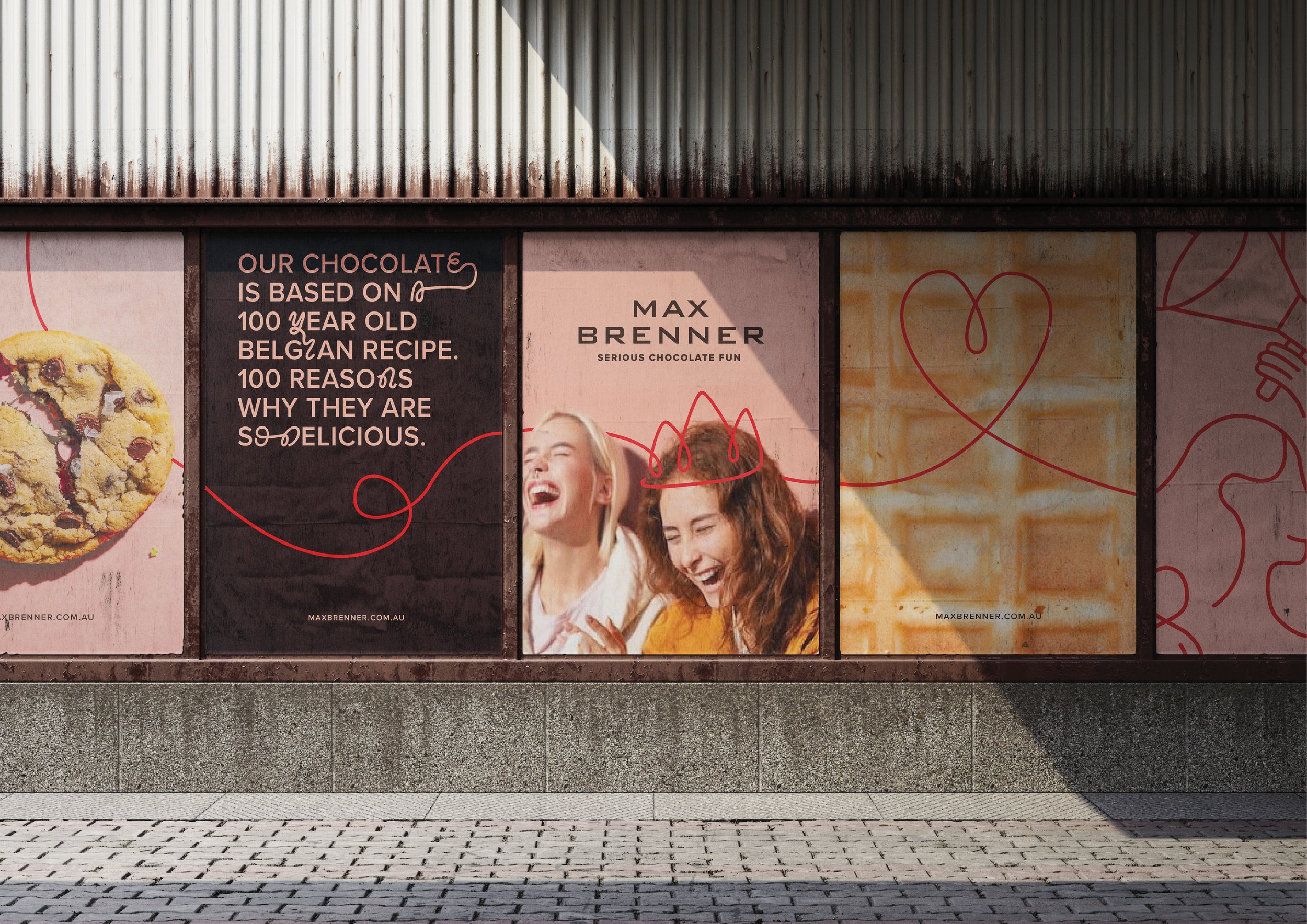
Max Brenner had the best hot chocolate in Australia—but the brand lacked the warmth and excitement to match. Our challenge? To reignite the passion and make every interaction as irresistible as the chocolate itself.
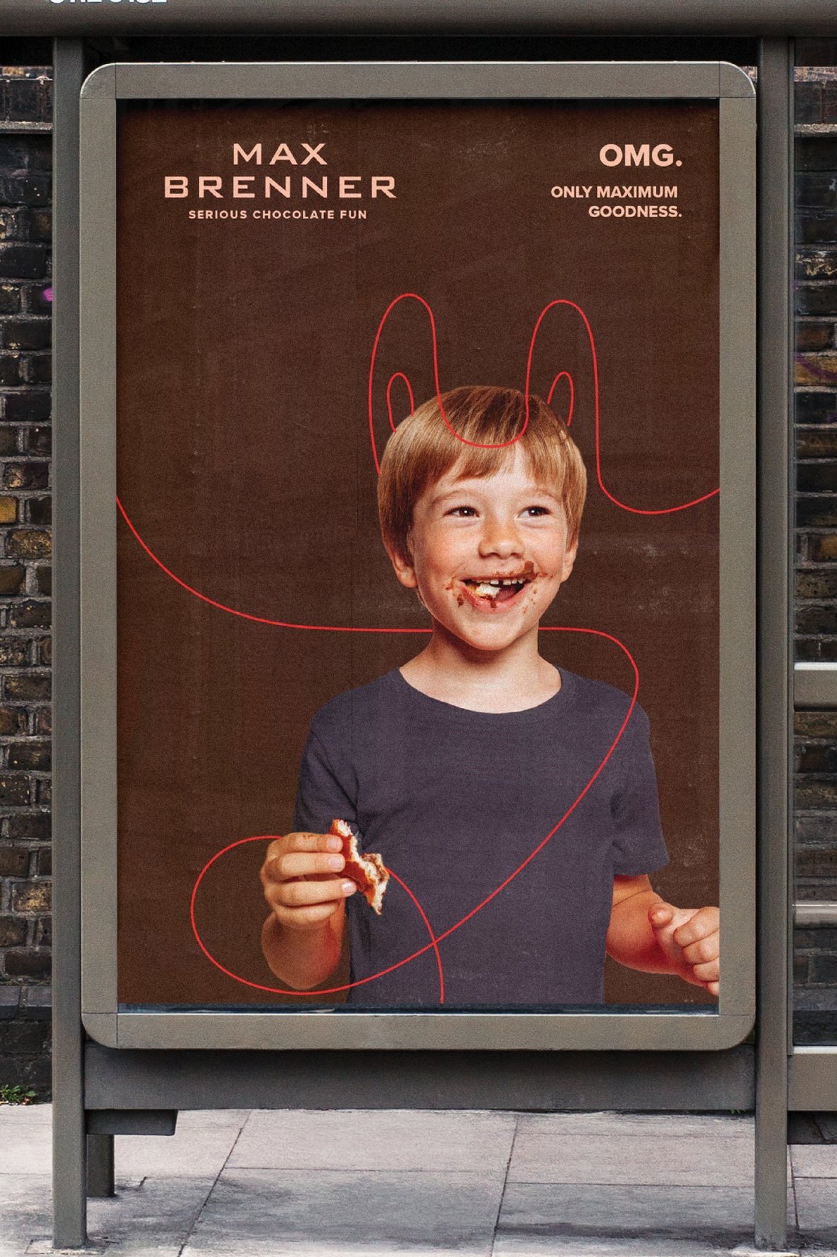
We started with deep brand research, identifying strengths, gaps, and opportunities. While the logo stayed, we sprinkled in a new tagline, strategic positioning, and a fresh, youthful energy. The result? A brand that feels as indulgent and exciting as its products.
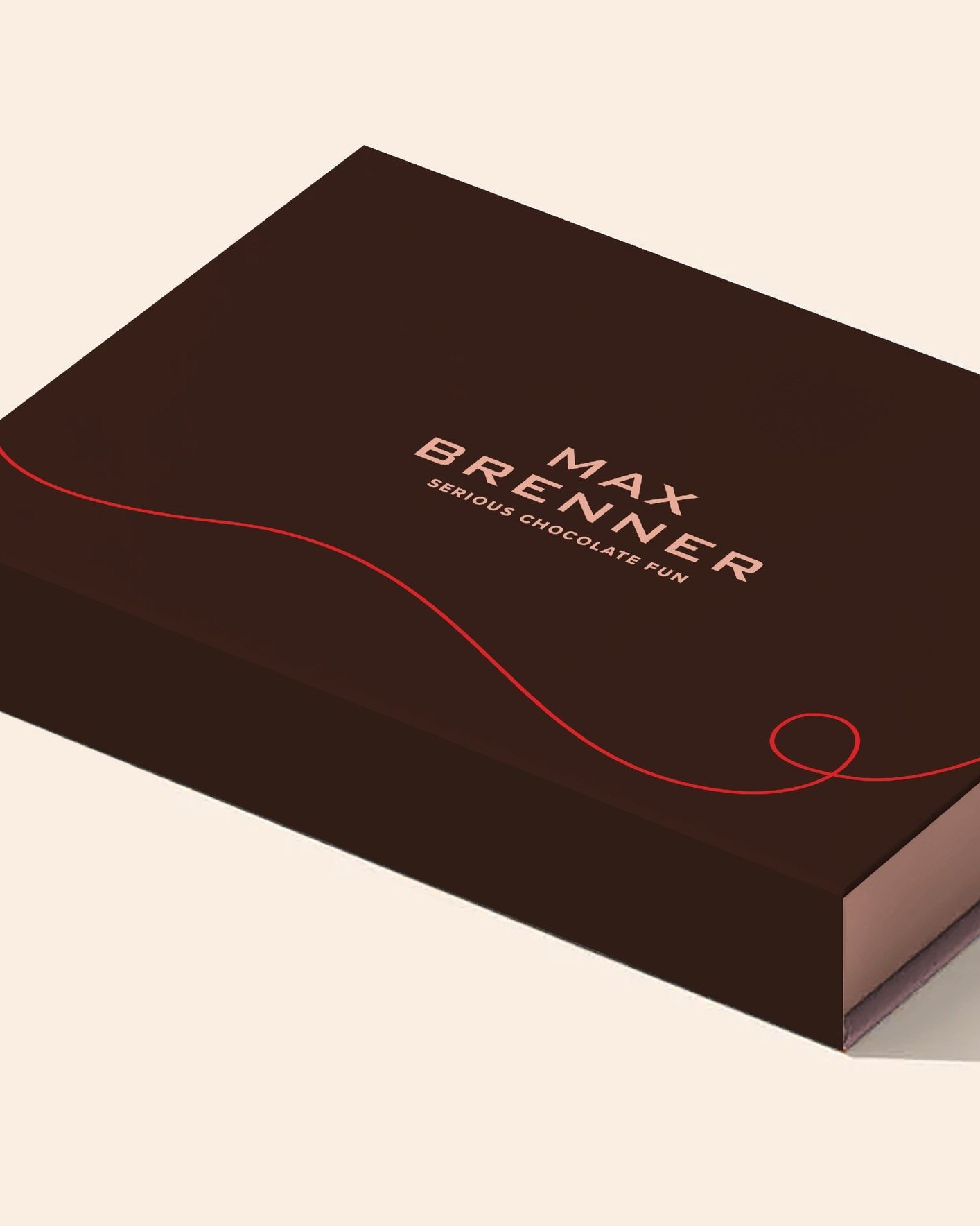
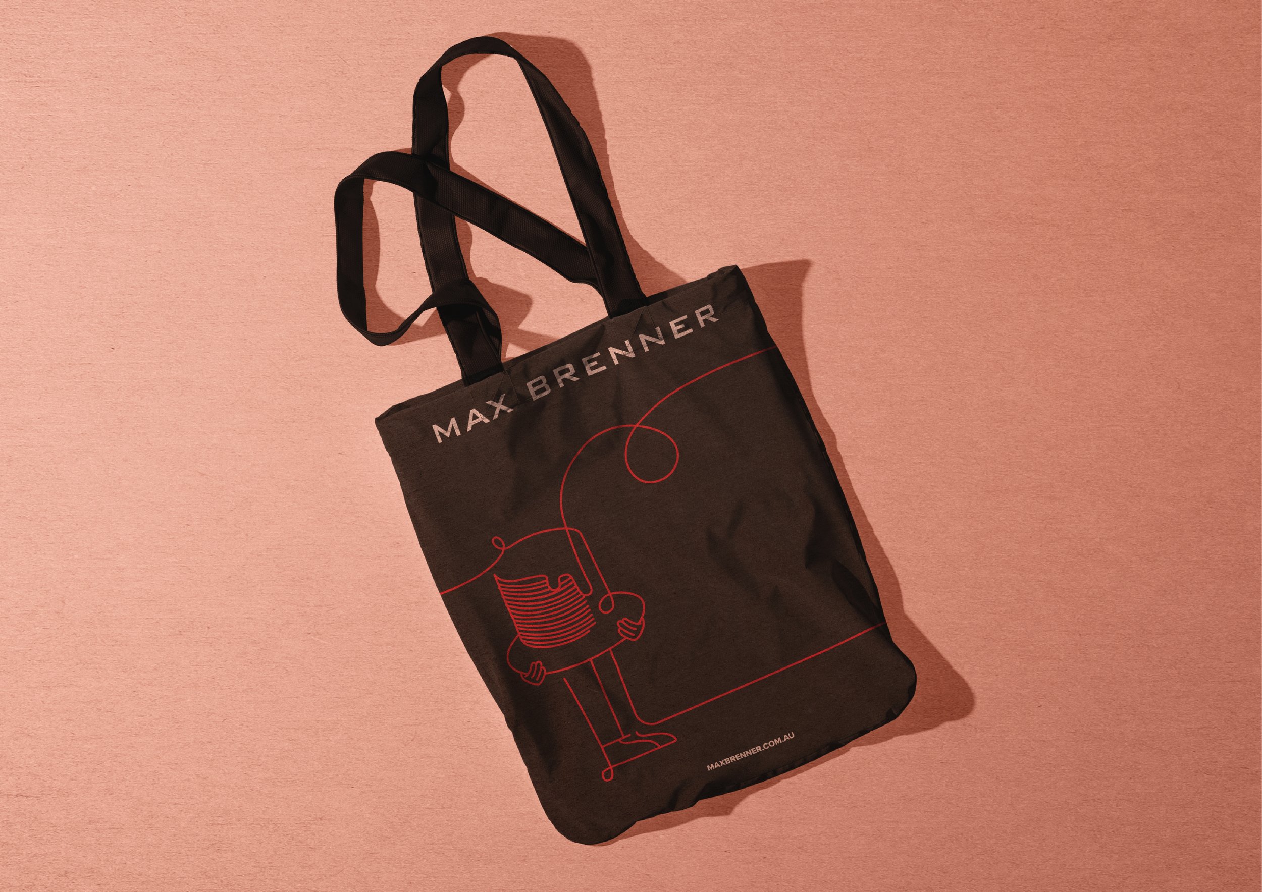
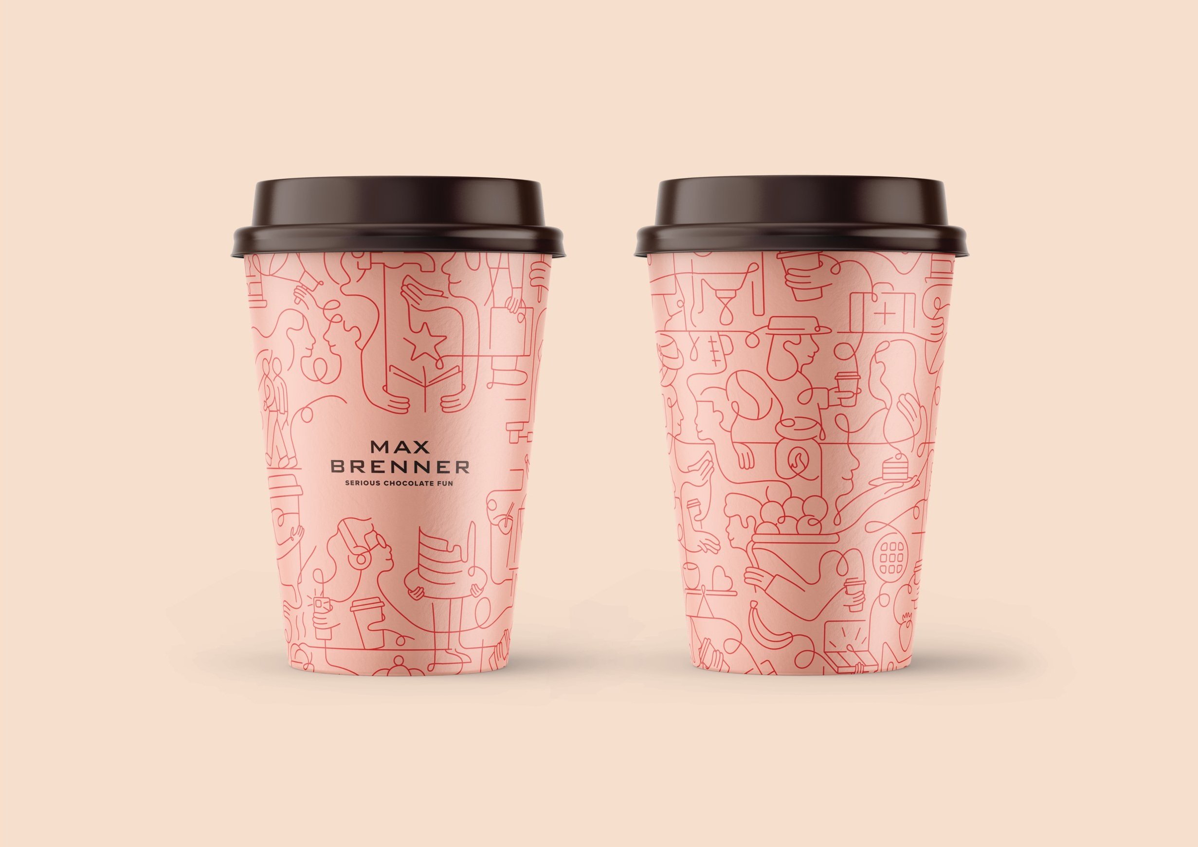
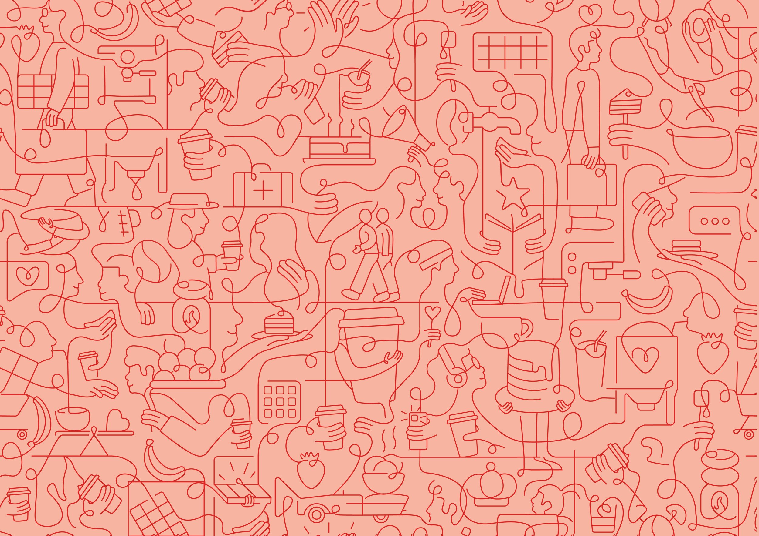
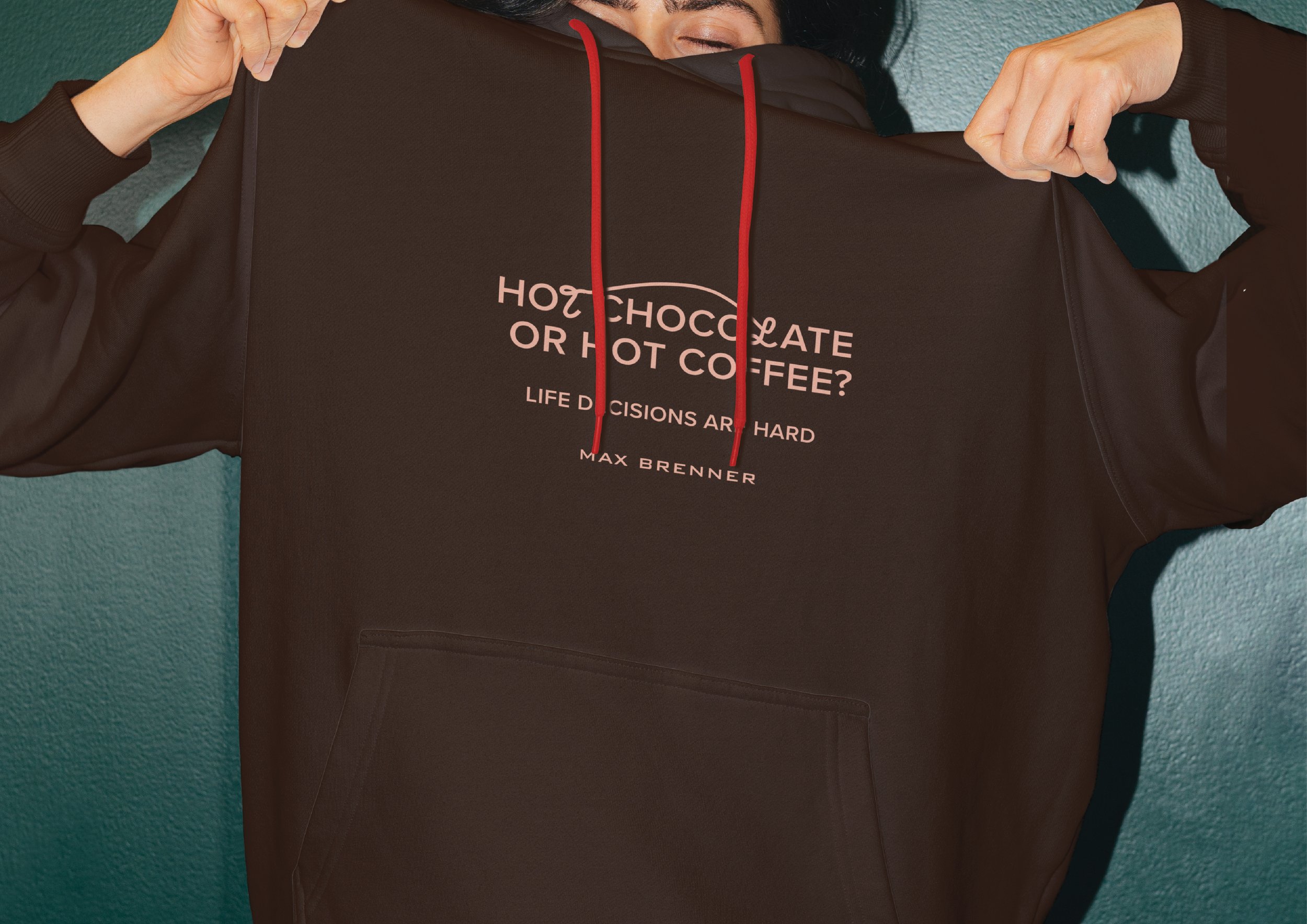
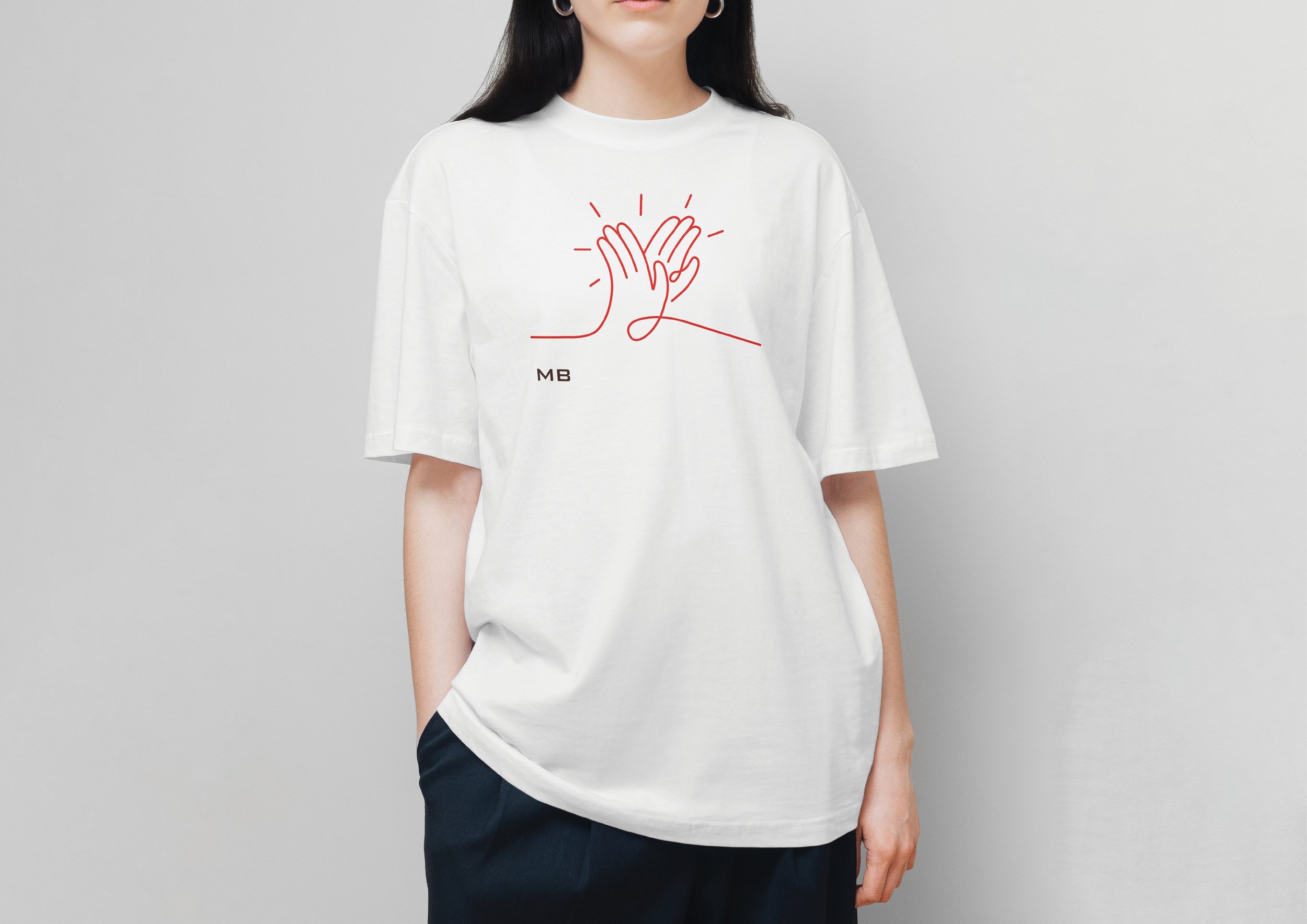
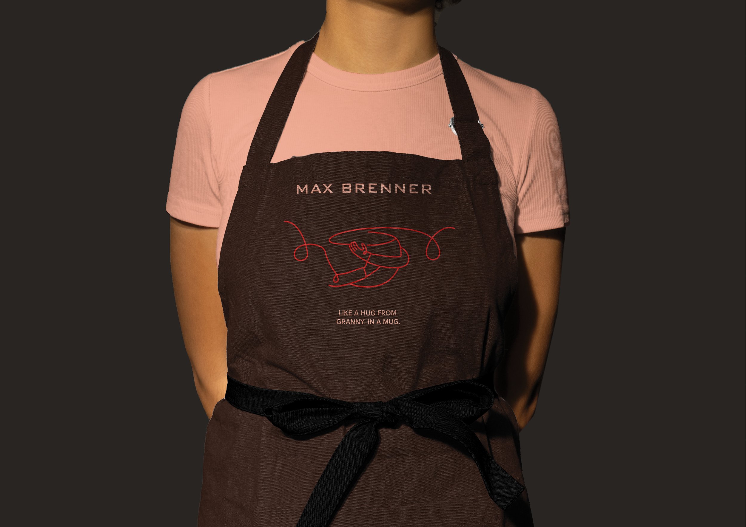
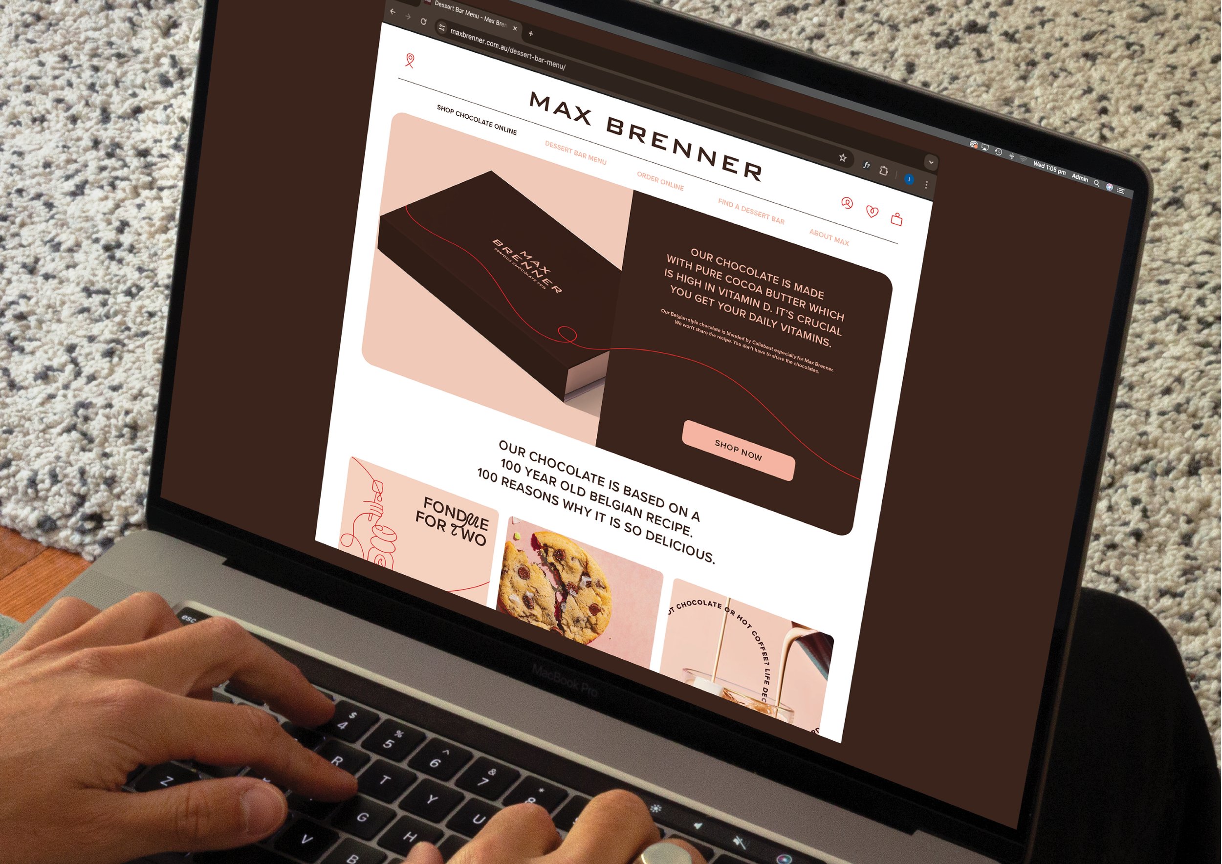
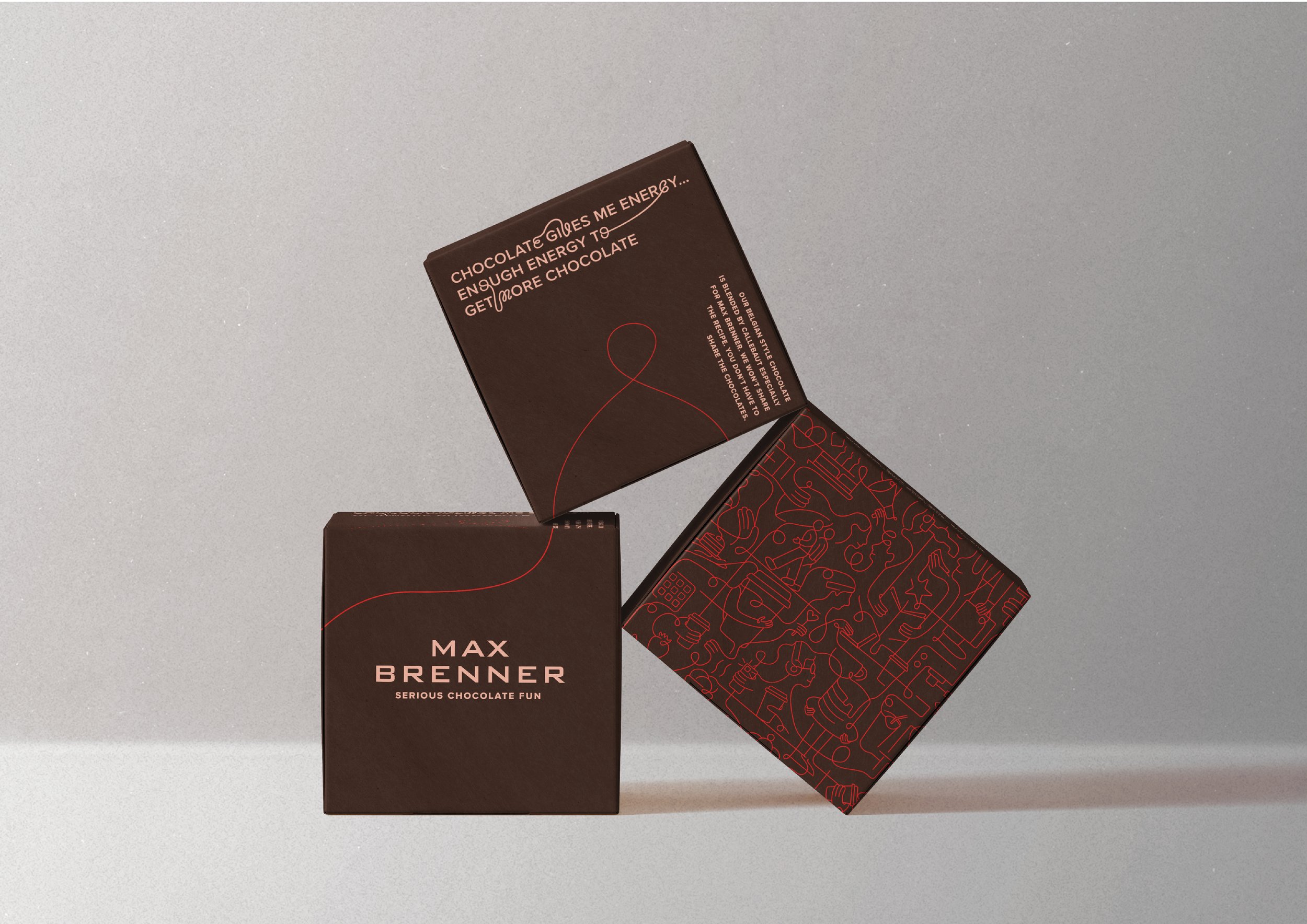
To bring this to life, we crafted a rich illustration style inspired by flowing melted chocolate, a playful typeface, and packaging that sparks an emotional connection. Expressive visuals, personality-driven copy, and clever design transformed Max Brenner into a magnet for chocolate lovers, old and new.
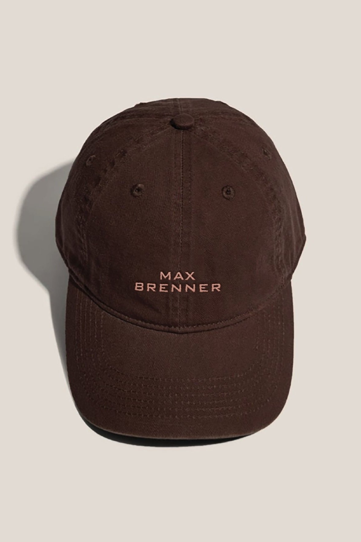
At the heart of it all, we believe a great brand is one people are proud to wear. We reimagined staff uniforms and merchandise, creating a fresh, vibrant look that reflects the brand’s personality while fostering pride and connection. This approach turned uniforms and merch into an extension of the brand, making every touchpoint a unified, crave-worthy experience.
Illustration and packaging designed at The Creative Method.