Red Rooster was Australia’s first and favourite chicken shop but it needed life support. In 2021 they jump-started it by adding fried chicken to the menu and a new burger range.
This was a massive move for Red Rooster, being the first menu innovation in years. This was also the perfect timing for a drastic brand transformation. They still wanted to appeal to all of their existing well-loved chicken-loving customers but wanted to introduce themselves to the youthful generation of chicken eaters.
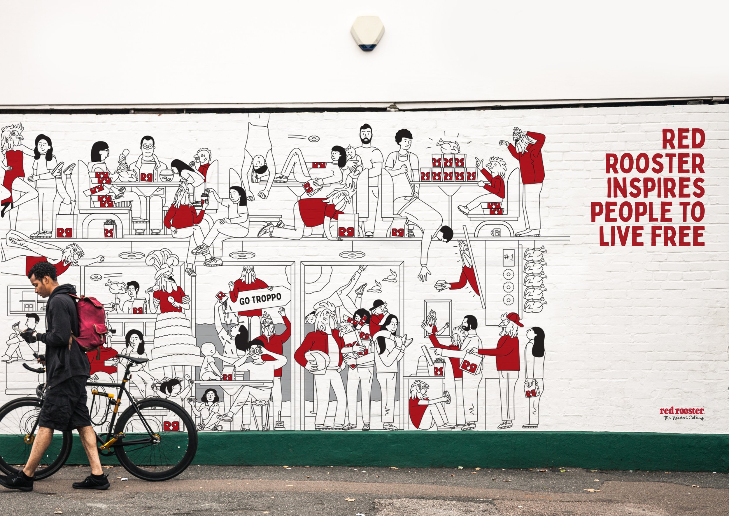
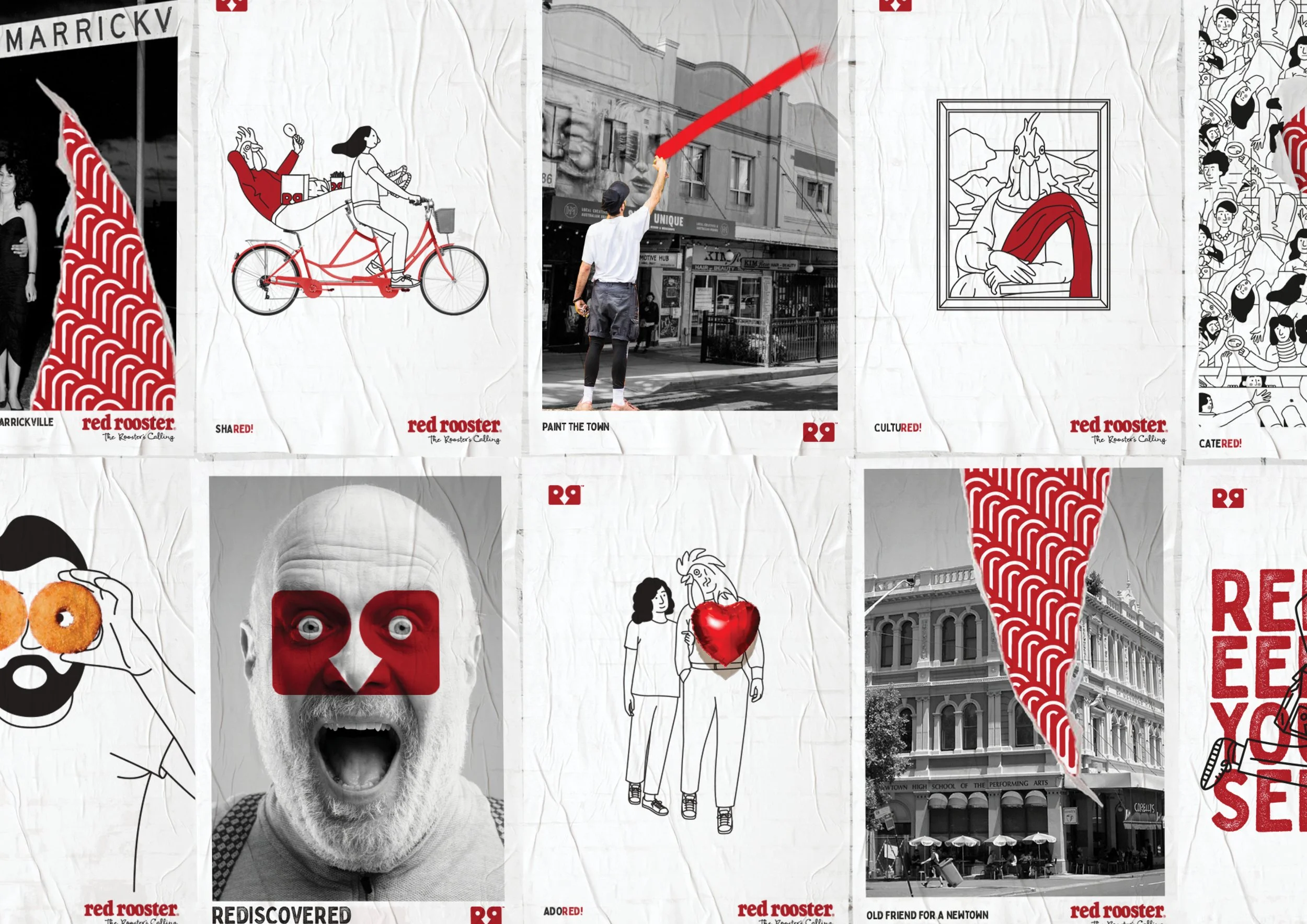
The previous Red Rooster brand felt dated and lacked personality. The task was to inject more storytelling, Aussie personality and humour into the brand creating a more emotional connection with their consumers and driving a sense of modernity.
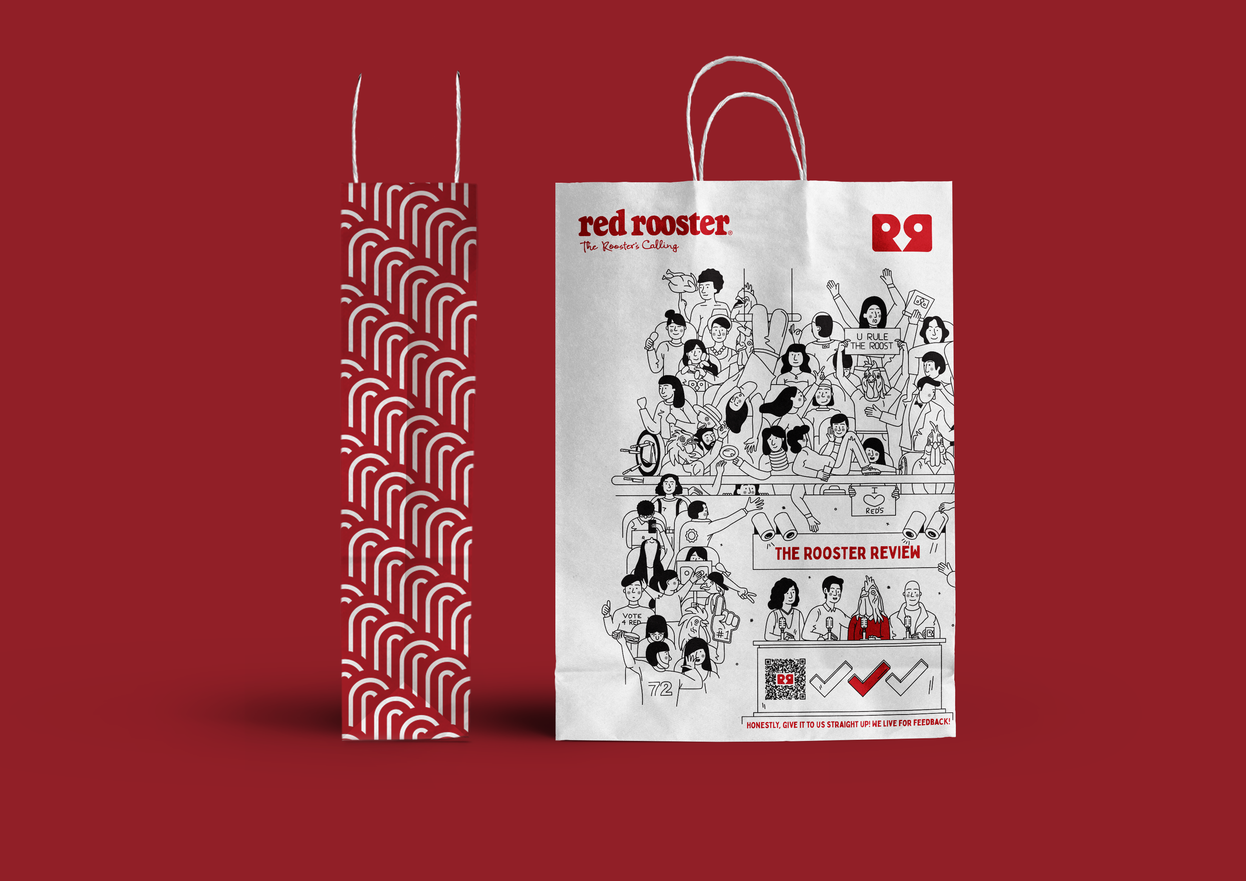
My task during this project was to develop a pattern that Red Rooster could own. They wanted to pay homage to their past whilst still feeling modern and youthful. I looked to their past branding and took inspiration from their previously designed logo from the 70s that feels nostalgic and iconic to the brand. With this, I created an ownable and distinctive pattern based of the plumage found on the vintage rooster.
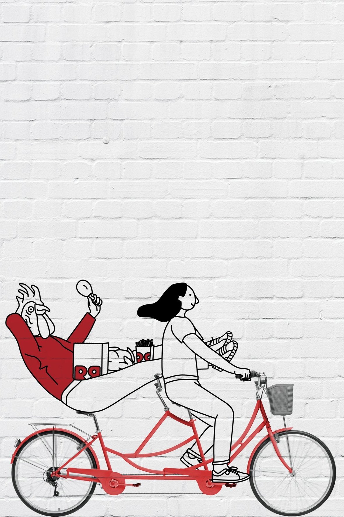
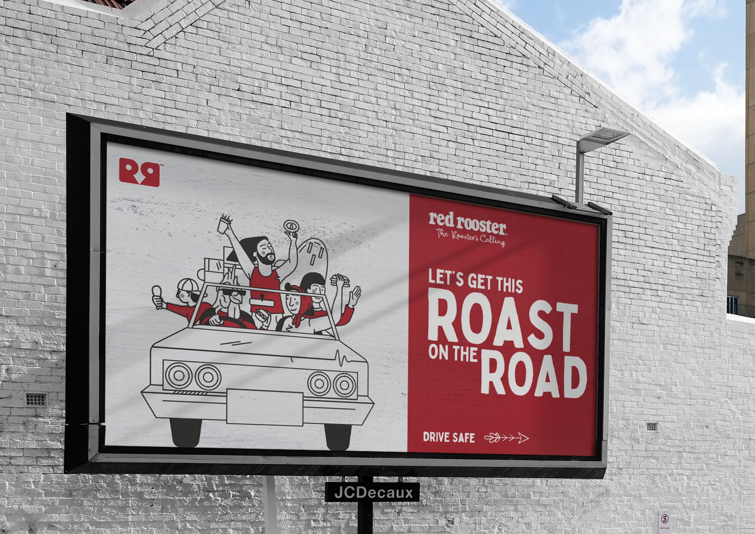
I also developed an illustration style that pays homage to Red Roosters fun personality. The illustration style is a simple and clean line illustration with a mix of human characters and rooster characters (with human bodies). This created a nice dynamic between the consumers and the brand and opened the brand up to creating clever and creative assets for its branding and packaging.
Illustration and packaging designed at The Creative Method.
Red Rooster