Nash + Banks
Nash + Banks’s vision is to ‘Make Better Possible’ and create products that have a positive impact on the earth more regularly available.
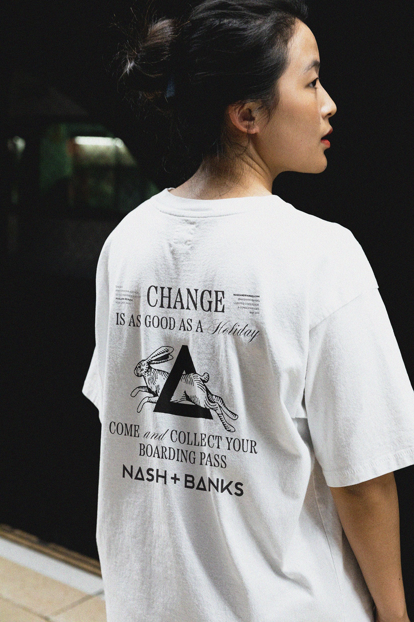
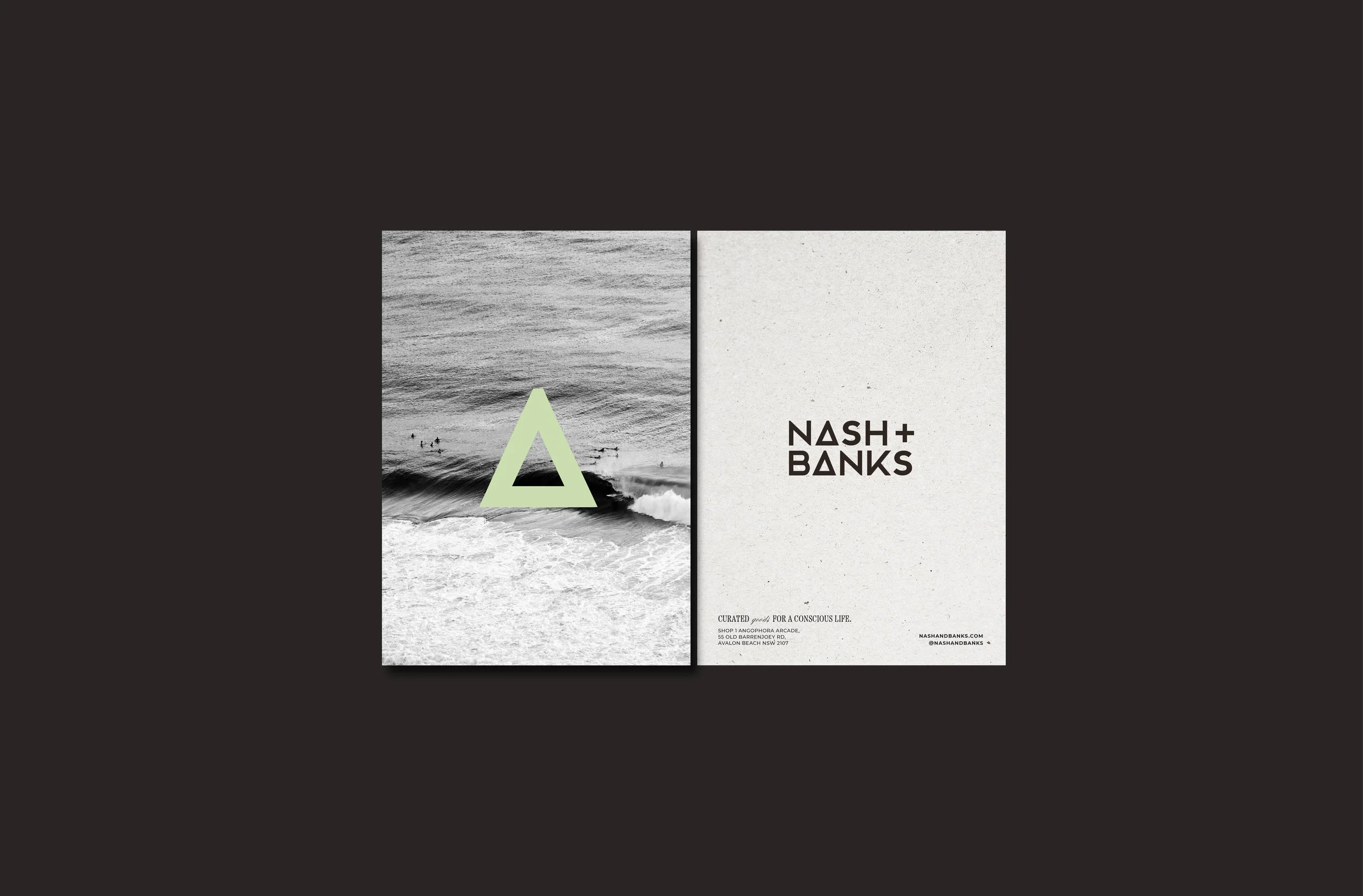
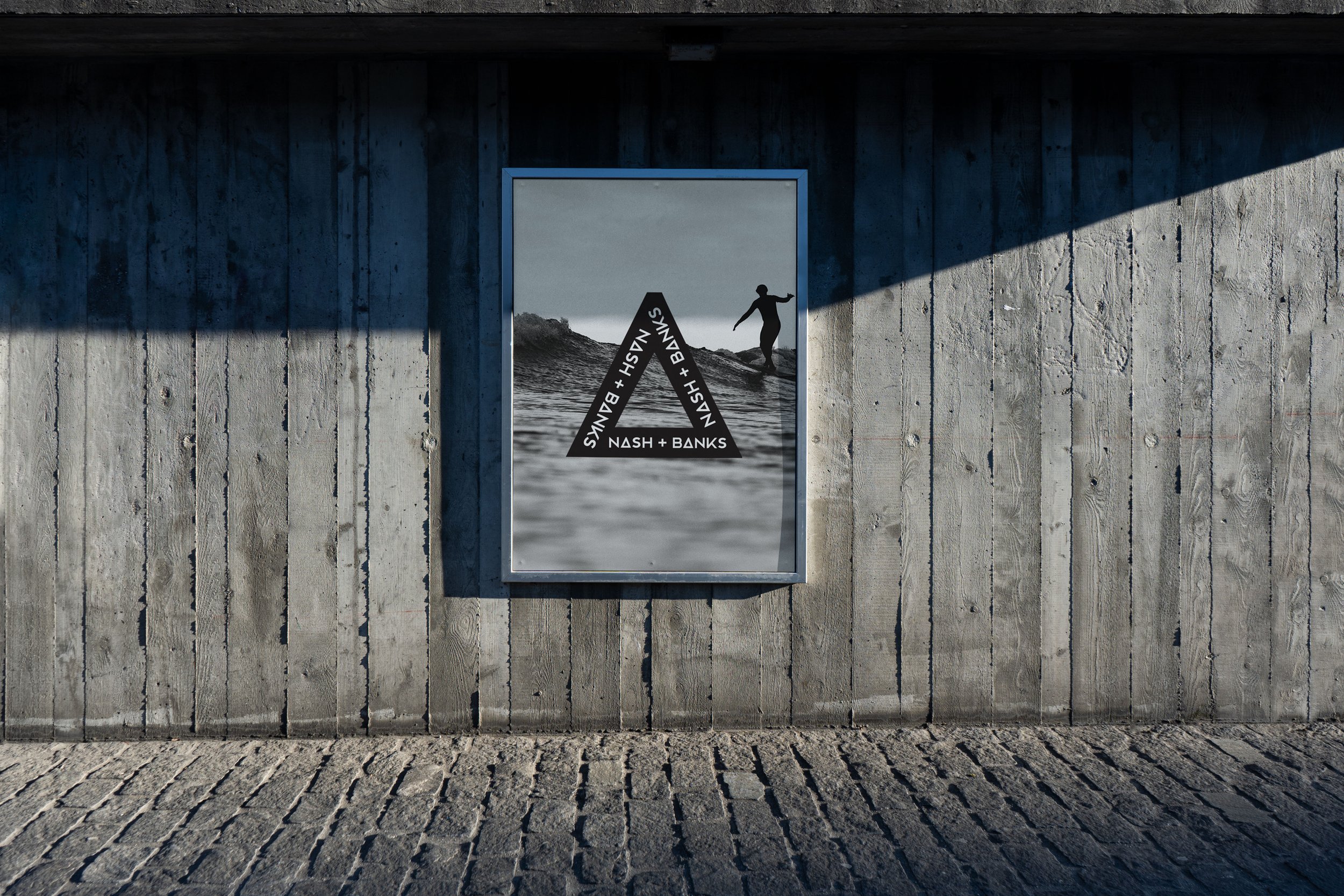
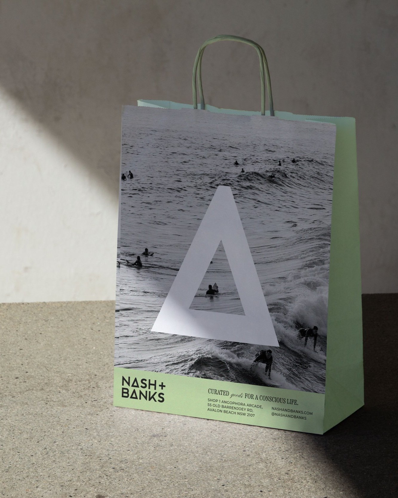
I collaborated with Niccii and Timo on giving their brand a bit of a spruce-up. When we initially started chatting about the project, they mentioned that they were a platform for change. This really stood out and led us to add the delta symbol to their logo. The delta symbol ∆ means change, paired with + representing positive impact. This allows for their brand message and values to be represented in their logo lockup, whilst additionally creating an ownable device.
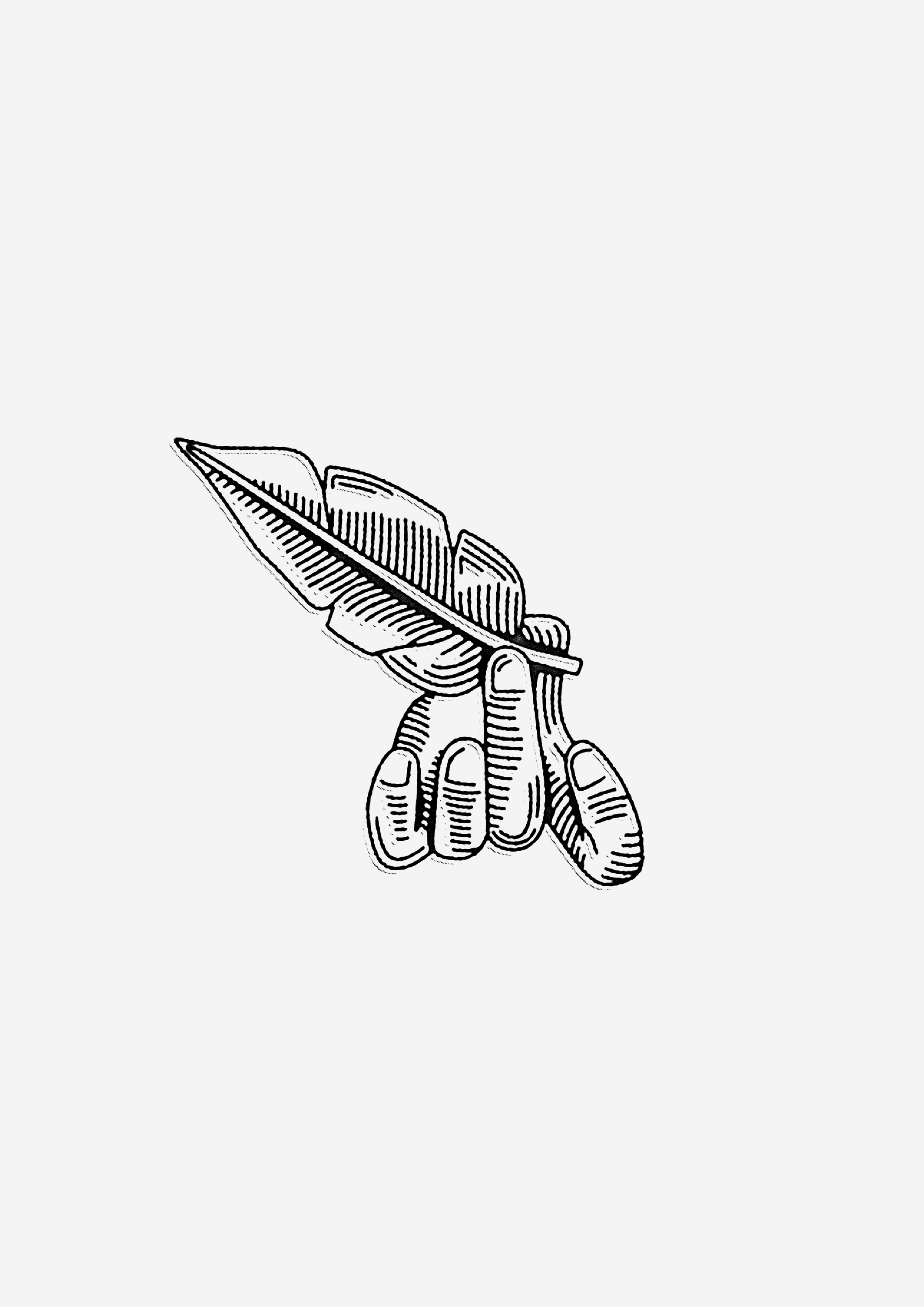
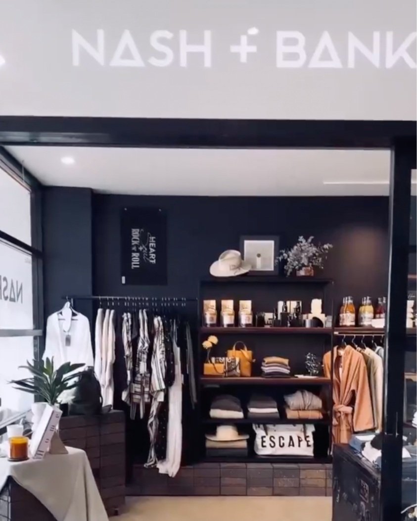
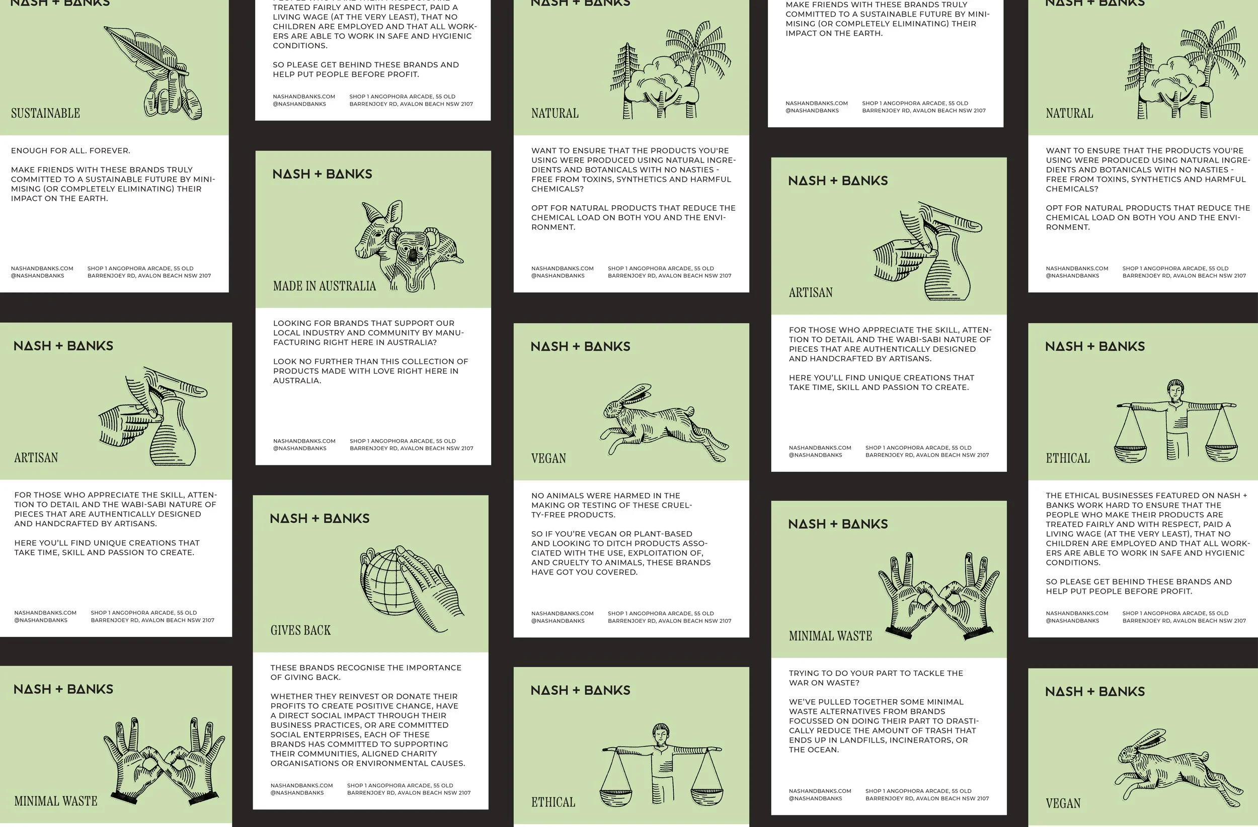
We wanted to keep the overall brand fairly tonal and clean to help reflect the products that they sell. Icons were also created to represent their brand values along with of earthy patterns and textures to help push their love for the earth.