Captain’s Seafood
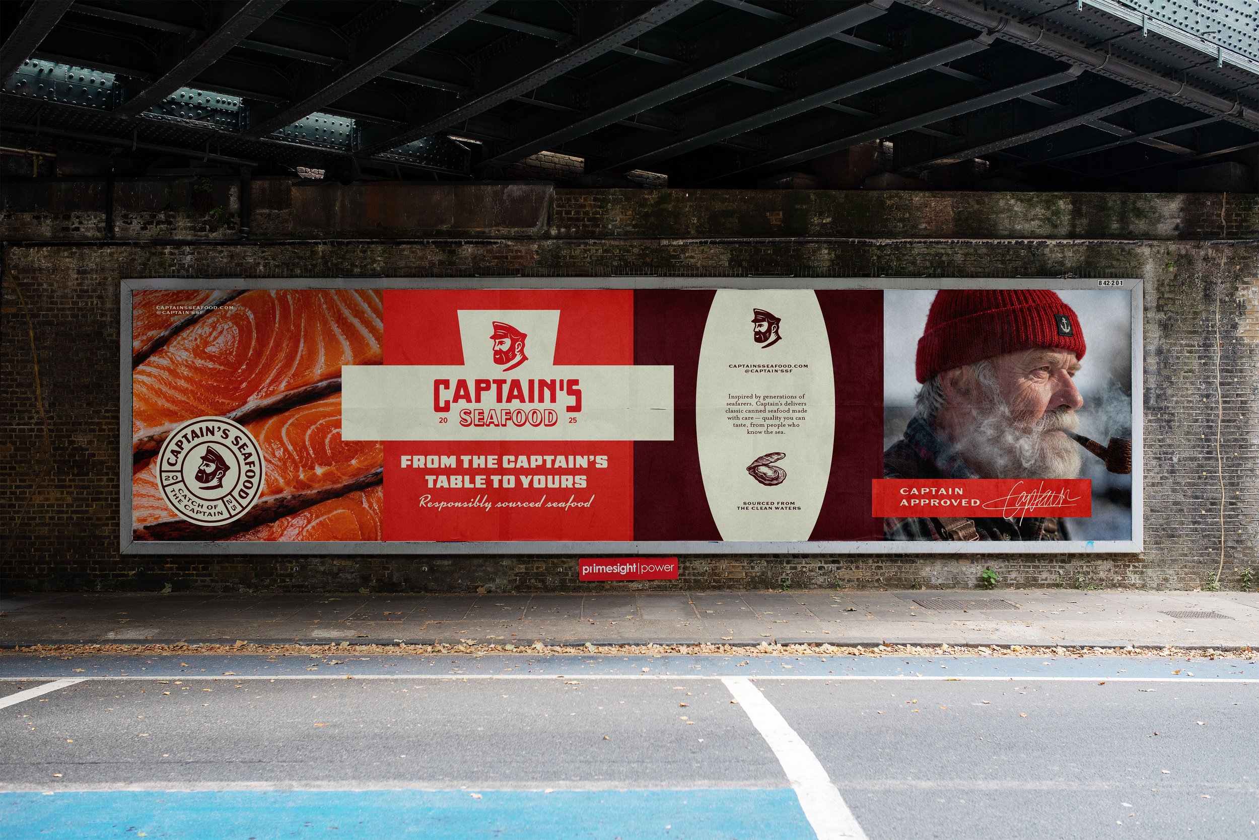
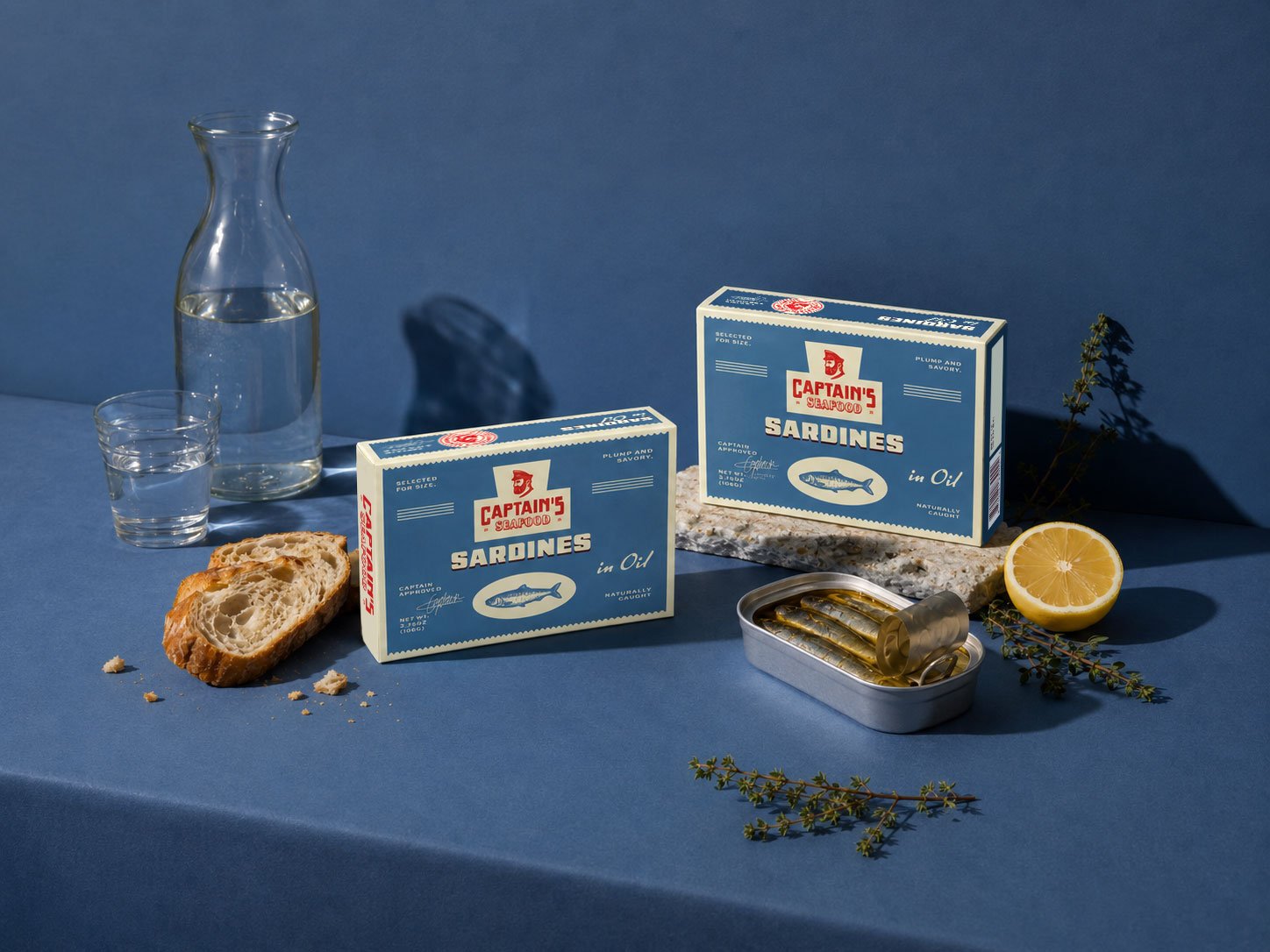
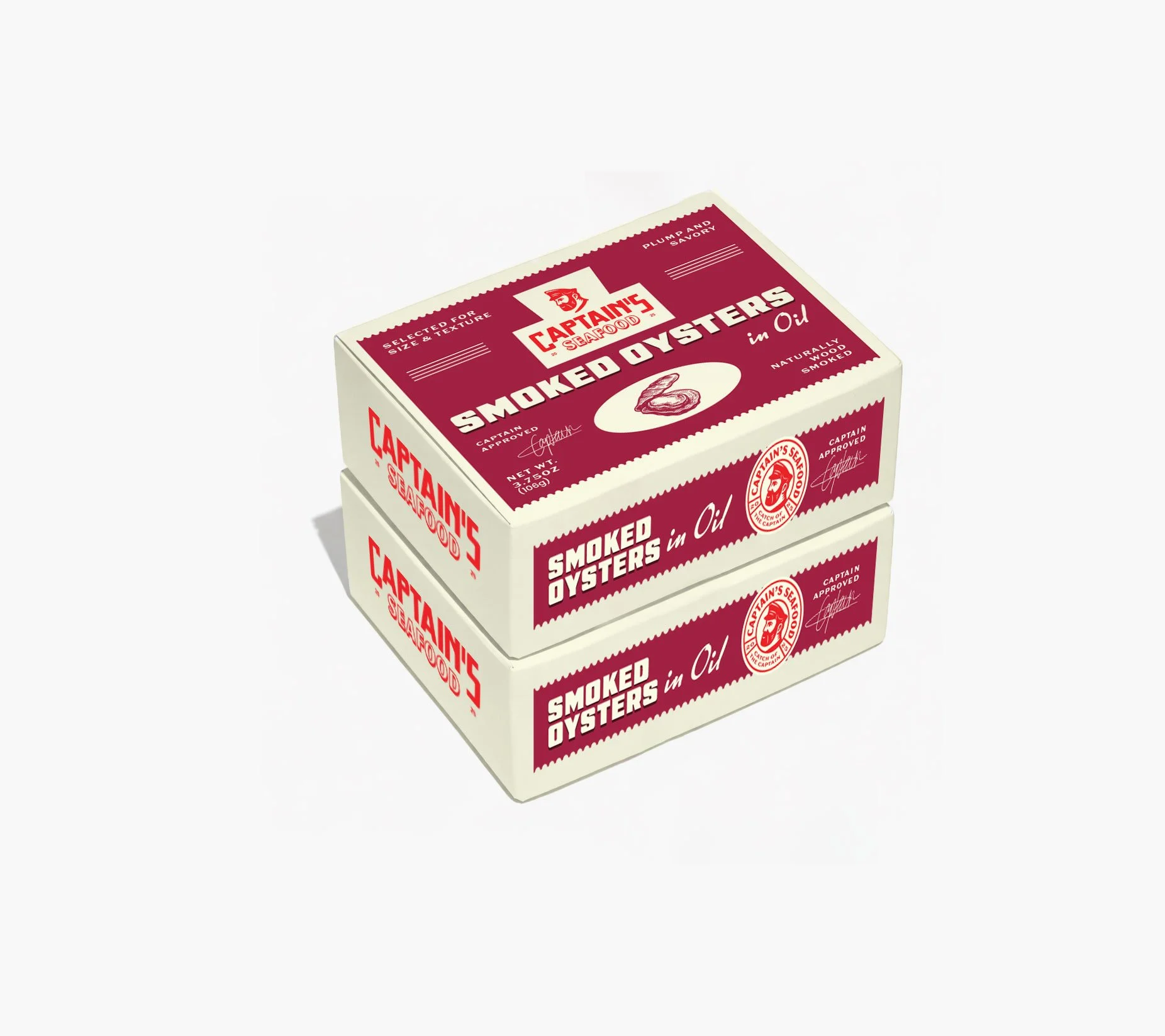
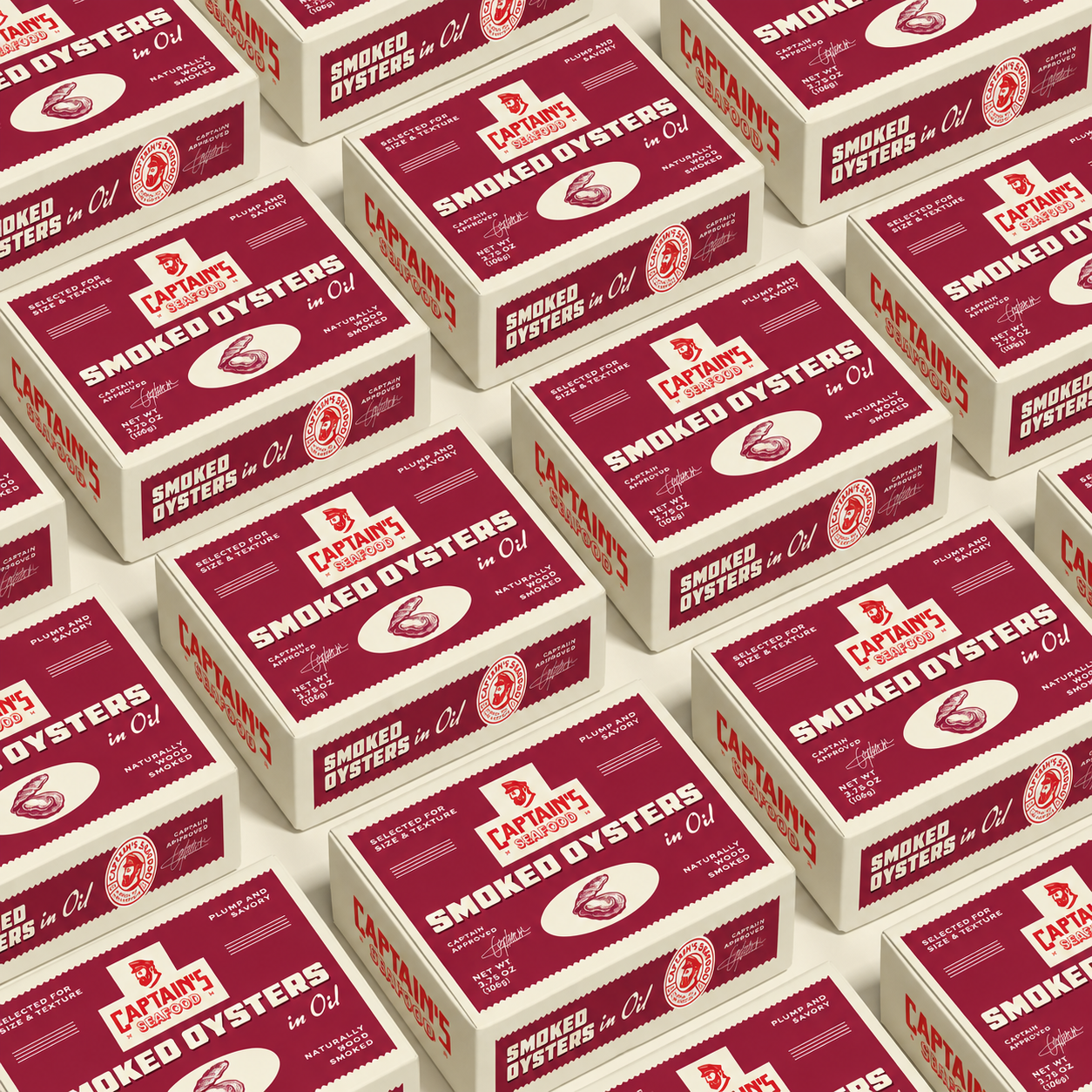
The idea behind this concept is to create a brand that feels established, trustworthy, and full of character. Rather than feeling overly corporate or modern, it leans into a vintage aesthetic to evoke a sense of history, heritage, and craftsmanship, helping elevate the perception of quality.
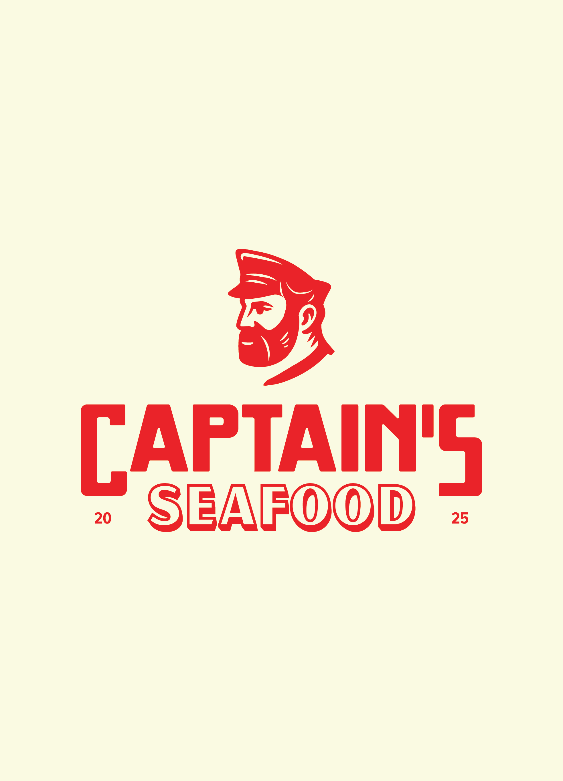
The hero of the brand is the woodcut-style captain illustration. Woodcut illustrations naturally carry a timeless feel, often associated with traditional printmaking and old maritime maps, making them a strong fit for the seafood category. At first glance, the mark appears to be a simple captain illustration; however, hidden within his beard is a subtle discoverable of a fish. This small detail rewards consumers who take a second look, creating a memorable moment that strengthens brand recall. These hidden discoverables help create a more ownable identity and encourage people to engage with the brand for longer.
The vintage-inspired typography and restrained colour palette continue this heritage feel, while the bold, simplified execution ensures the brand still feels clean, confident, and stands out on a modern supermarket shelf. Together, these elements create a brand that feels authentic, premium, and approachable-bringing personality to a category often dominated by traditional, corporate-looking competitors.